
===
- Mobile Navigation Research
- The Website Timeline
- Content Strategy
- Style Guides
- Design Trends (links)
- Web Typography
===
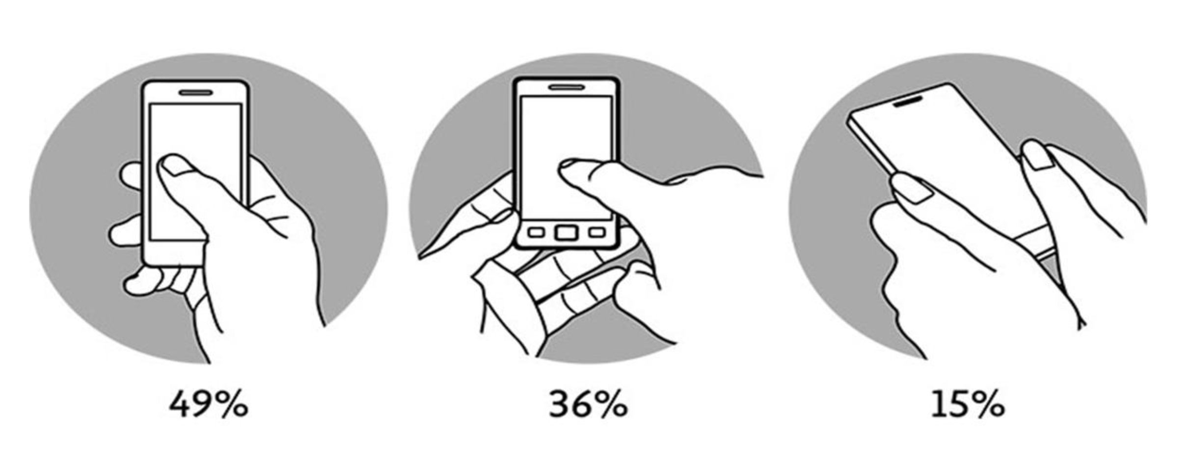
Tapping, screen size, thumb reach affect mobile navigation
Bottom Navigation Pattern On Mobile Web Pages: A Better Alternative? (2019)
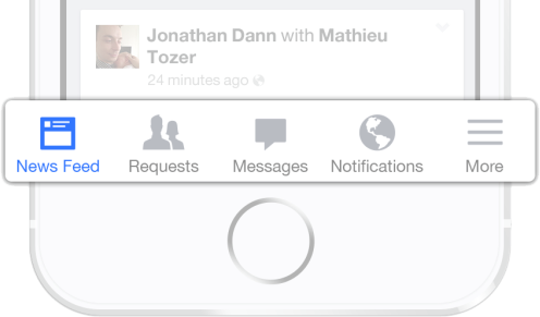
Bottom navigation bars (iOS Tab Bar, Android Bottom Nav) stay in place and should be limited to five items
Design for Mobile (DZone 2016)
Optimal button size:
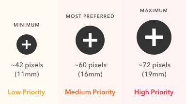
users had the lowest touch accuracy on buttons less than 42 pixels. Buttons over 72 pixels also had low accuracy.
The highest accuracy was found with buttons between 42-72 pixels — 42 pixels is the minimum and 72 pixels is the maximum button size.
The most preferred button size was 60 pixels, which is about the middle of the range. The 72 pixel button produced the highest touch accuracy and was preferred by older users.
Optimal button spacing:
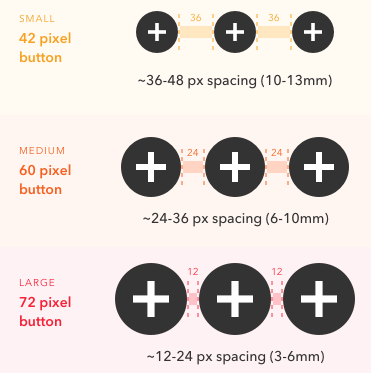
Optimal Size and Spacing for Mobile Buttons (UX Movement, 2019)
For Best practices when designing for mobile:
see Mobile UX design principles and best practices
And a sobering lesson:
How an Interface Mode Killed 10 Sailors
Once your website is live, for a deeper dive into
mobile-freindly design and building, check it with
Google's Is your web page mobile-friendly?
===
IA, research, wireframes, coding… fall into five areas:
- planning: who is this for?
- content: preparing and sorting
- design: the PARC principles+
- development: coding the site
- deployment: launching on the web
These will overlap!
===
“when you’re designing a website, you should think about your content first.”
“we often created sites without thinking about strategy at all … we would first design a site that looked nice and matched our branding. Next, we made a list of all the stuff we wanted to put on the site (content), and then tried to fit all of our stuff into the newly designed site.”
Clarissa Peterson (2014), Learning Responsive Web Design
The infinite "chicken and egg" loop:
- Project manager: We need a website for client X!
- Designer: I can’t start the design until I see some content!
- Programmer: I can’t code the design without a style guide!
- Writer: I can’t start writing until I know the strategy!
- Project manager: (stressed) we need a website…!
Content strategy is the chicken and the egg…
Naming: labels, headings, URLs (CSS classes, JavaScript functions)…
There are only two hard things in Computer Science: cache invalidation and naming things
—Phil Karlton (accomplished software nerd, Xerox PARC etc.)
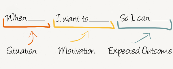
Are Job Stories the new User Stories?
Designing features using Job Stories
Writing text content:
- use subheadings and brief paragraphs!
- some sites need long, detailed copy
- others must be stripped to the bare minimum
- or you can strike a balance between the two:
- up-front simplicity > details on request
drill down: a user-interface design pattern—users see a summary but can get more detail—write text for both
Simple In-Place Drill Down:
Search Engine Optimisation (SEO)
Never, ever pay for SEO—instead, build it in!
- semantic HTML5 tags are essential
- tiered headings: one
h1tag per page,h2for each section - structured content (subheadings, lists, tables…)
The Google SEO Starter Guide is excellent!
Your audience:
- Educated and/or sophisticated?
- Have specific interests or focus?
- Just casually browsing?
- From a certain demographic/gender/nationality?
Make every design and content decision align with your overall website strategy
Getting your message across:
- What is the most important thing?
- What’s the least important?
- What needs to be said first (the hook)?
- What leads visitors to click a call to action…
…calls to action—help visitors make a decision:
- What do you want people to do when visiting your site?
- Do you have a simple and prominent call to action?
- What is the precise call to action wording?
- What emotional/mental factors motivate people to act?
When Steve Jobs returned to Apple in 1997, there were sixteen to eighteen models of computer… even he couldn’t give clear advice to a friend on which Mac model she should buy. He cut the number of models to four: two desktop and two laptop computers. The Apple product line then reflected this strategic focus on real user needs and a meaningful product differentiation.
—abbreviated from: Web Style Guide, Patrick J. Lynch and Sarah Horton
There’s no such thing as “mobile content”. What all readers and users need is good content, available wherever and whenever they need it, on any device. If some of your content looks superfluous on a mobile device, it’s certainly superfluous for desktop users as well. Get rid of useless fluff!
The measure of good editorial style is whether the content is useful… it should meet carefully researched user needs …corporate and institutional web teams often produce content designed primarily around internal goals and organization charts, forgetting that users couldn’t care less about mission statements or organizational structures.
Condensed from Editorial Style (Web Style Guide)
Also see Writing for the Web
Read more from these articles and sites:
- UX Movement has helpful menus
- Content Strategy Within The Design Process
- Web Style Guide, Chapter 1: "Strategy"
That Web Style Guide page has a good section on
Social Media Strategy
===
A style guide document keeps an organisation’s printed and web materials within their style:
- layout
- graphics
- colours
- fonts
- logo
- photos
Download PDFs of these three style guides:
The Campaign Energy Dashboard used NUS guidelines
three big tech companies have interface guidelines
They’re long, detailed and technical—so just scan through
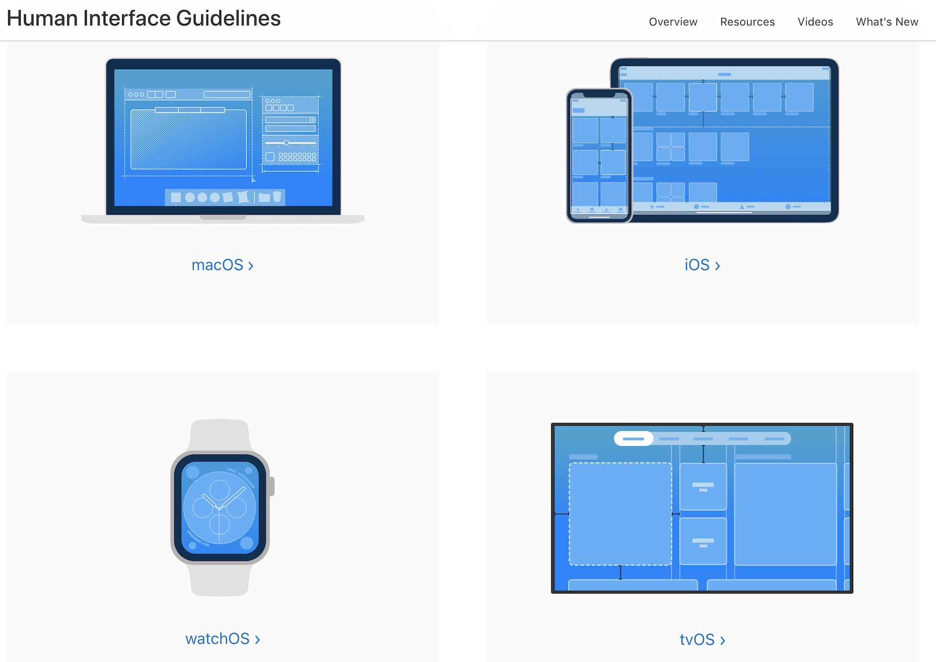
Apple Human Interface Guidelines
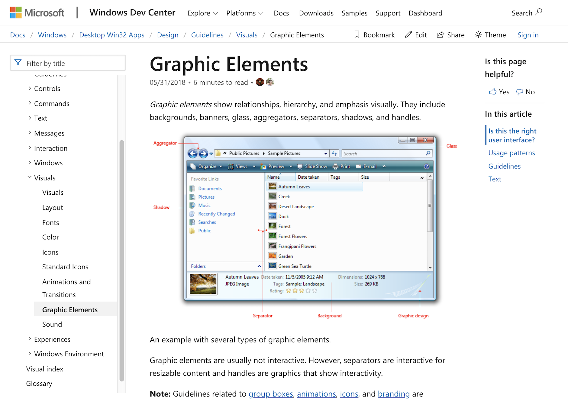
Microsoft User Interface Principles
===
UXPin Studio have some great resources:
- free design e-books
- a guide to creating style guides
- articles on:
(you can by-pass promotional material for the UXPin interface builder)
Download PDFs of these three style guides:
===
95% of the information on the web is written language. It is only logical to say that a web designer should get good training in the main discipline of shaping written information, in other words: Typography.
Oliver Reichenstein, Web Design is 95% Typography, 2006
our harassed contemporaries simply cannot take everything that is printed today.
It is the typographer’s task to divide up, organize and interpret this mass of printed matter in such a way that the reader will have a good chance of finding what is of interest
Emil Ruder, famous Swiss typographer, 1969
recommended web typography primary sources:
Patrick J. Lynch and Sarah Horton, 2016
Choosing a typeface is not typography…
…but here's a little inspiration that uses Google Fonts:
Beautiful Web Type
optimum line length for readablity was supposed to be 50-75 characters…
…but The Line Length Misconception draws on more recent research, although line-spacing, letter-spacing and font-family helps—see Optimal Text Layout Line Length
…and the advice continues in more detail for mobile devices in How To Set Perfect Line Lengths For The Web
…and finally Letterspacing Makes ALL CAPS Easier to Read
Go further:
Technical (CSS) information from another module
—use the down cursor key.
And see:
===
What are your website design ideas?