-
Notifications
You must be signed in to change notification settings - Fork 64
New issue
Have a question about this project? Sign up for a free GitHub account to open an issue and contact its maintainers and the community.
By clicking “Sign up for GitHub”, you agree to our terms of service and privacy statement. We’ll occasionally send you account related emails.
Already on GitHub? Sign in to your account
List selections should be different colors when focused vs blurred #172
Comments
|
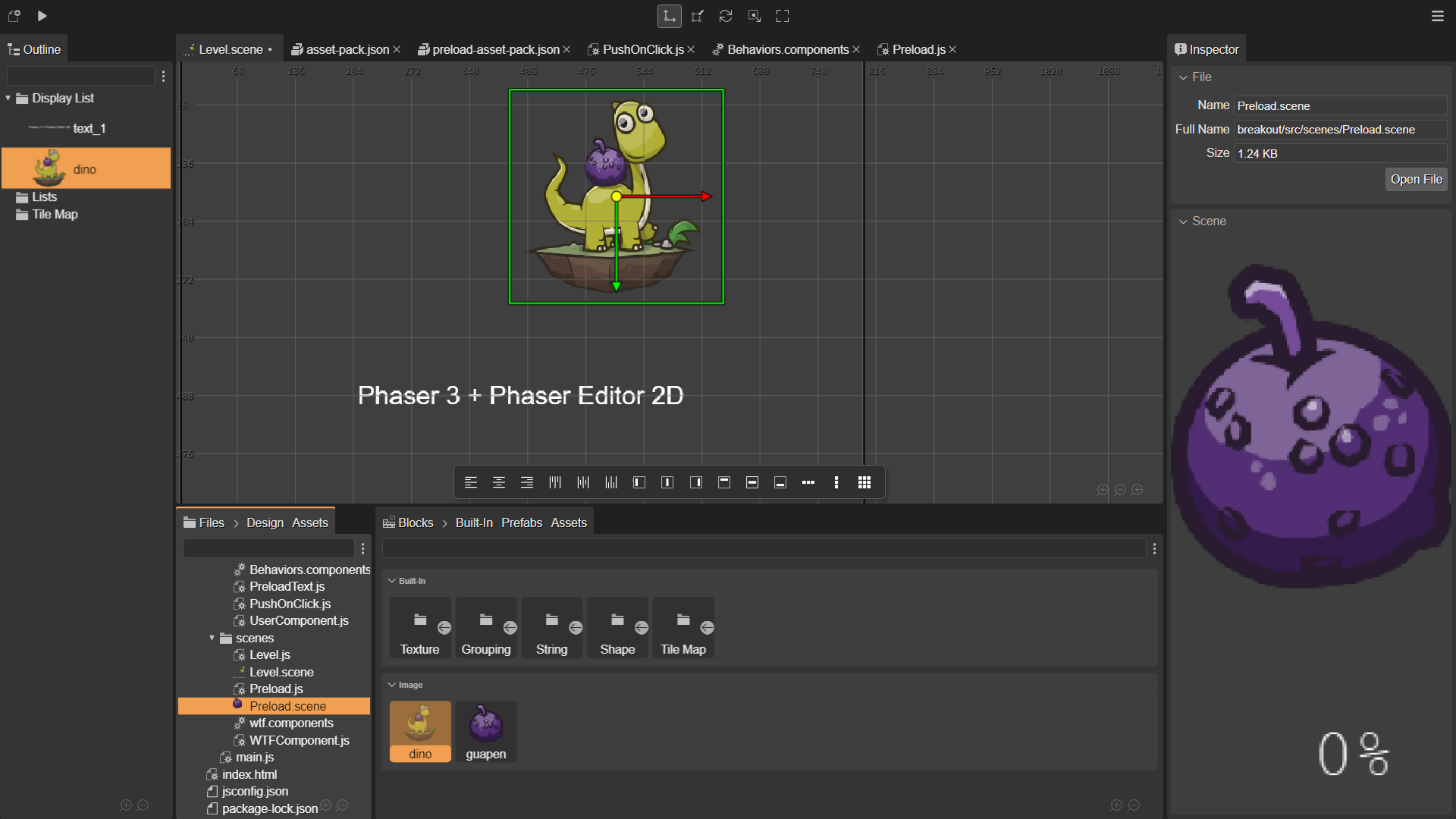
The workbench's active part is highlighted. In that image, the Files view is the one selected. |
|
The active Workbench part may be highlighted, but I cannot tell which one is highlighted even by looking at my own screenshot right now. The highlighting is too subtle, I guess. I did see that highlighting subtly changed as I selected different parts of the Workbench, but it wasn't enough to tell my brain to pay attention to that part. After looking at the Inspector carefully I realize the Files view must be highlighted, so I guess the fact that its background is the same light background as the Blocks.Images panel means it is selected. Besides the unselected and selected gray being very similar, the unselected Blocks.Images background being the same as the selected color makes it even more difficult to figure out. |
|
With the Light Blue theme I think it is more explicit. |
|
Ah! I do see the section highlight line. I think really the bright orange (or blue) selection is enough to show the user what is focused, as it stands out so well. Just changing the "selected in an inactive part of the Workbench" color should be all that's needed. |
|
Yes. The only "problem" with it is that each time you select a new part the IDE has to re-render all the other parts based on viewers. But it is fine. I will think about this. |
|
Hmm... I was going to suggest you rely on the .activePart CSS hint, but I see that the selected items are drawn in a canvas, not using HTML. Well, good luck :) |

The

shows how difficult it is to know what context I'm in, when 4 different items are all selected and colored orange. I keep trying to do actions and being surprised that they don't work, or misunderstanding the context of a Property Section.
Either selections should be limited to one item at a time in the entire Workbench (so clicking e.g. the dino block would unselect Preload.scene in the Files view etc), or non-focused selections should get their own color e.g. greyish-orange in the Dark theme (so the dino block would be selected orange and Preload.scene in the Files view would be selected greyish-orange.)
The text was updated successfully, but these errors were encountered: