Plot statistics
This tutorial will show the power of GUI for online monitoring of the core process. The idea is that all statistics from the RTAB-Map algorithm are sent after every iteration to the GUI. These statistics can be plotted/viewed in different ways.
-
Open RTAB-Map application.
-
Show the Statistics panel : Menu Window -> "Show view" -> Statistics.
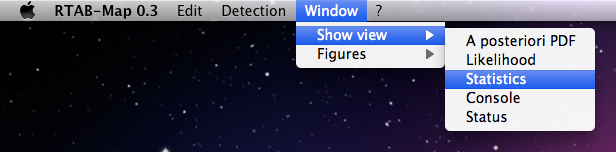
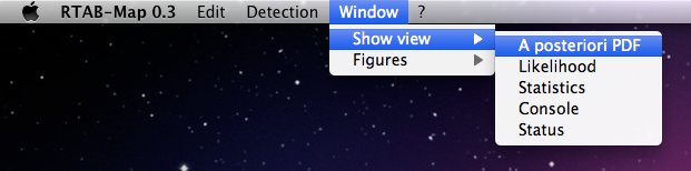
- Show the Posterior panel : Menu Window -> "Show view" -> A posteriori PDF.
- Apply settings to the detector : Menu Edit -> "Apply settings to the detector".

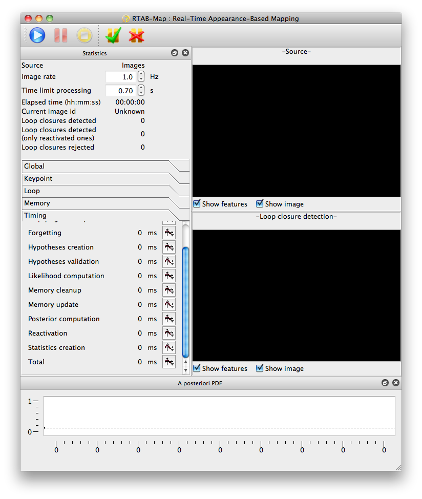
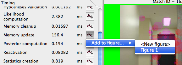
- You should see some tabs appearing at the bottom of the Statistics panel. Expand the Timing tab. You should now see a main window like this (vertical layout is set in the GUI settings of the Preferences dialog).
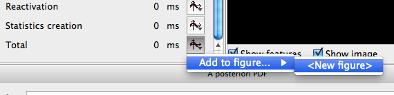
- Create a new plot figure with "Total time" statistic in the "Timing" tab.

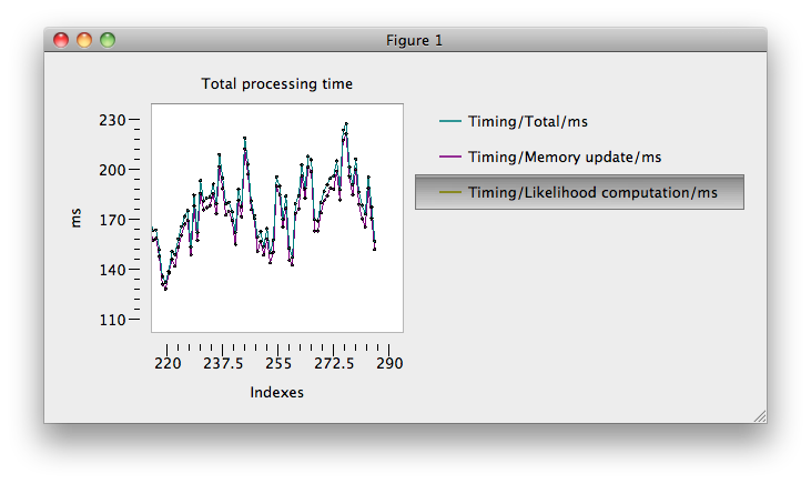
- You can customize some attributes of the plot with a right-click on the figure. Here we set "Maximum items shown" to 50, "Show grid" and modified the Title, xLabel and yLabel.

- Start the detection for some images. Data should gradually be added to the plot. After a while, you can have something like that. Pause the detection.

- Now add a new statistic to the figure 1. Add "Memory update" and "Likelihood computation" of the "Timing" tab to figure 1.
- Resume the detection for some iterations. You should see something like this (we disabled the grid).

- For a better viewing of some curves, you may want to hide other curves. Click on the legend "Timing/Likelihood computation/ms".
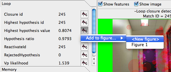
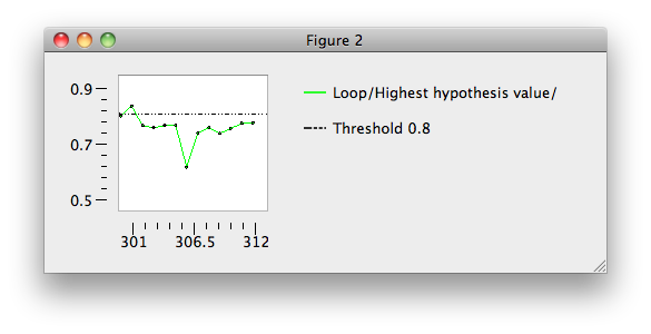
- Another thing you may want to do is to set a threshold in the figure. Lets create a new figure with the statistic "Highest hypothesis value". So we now have a figure 2.
- Open the context menu of the figure and select "Add line" -> "Horizontal line ...".
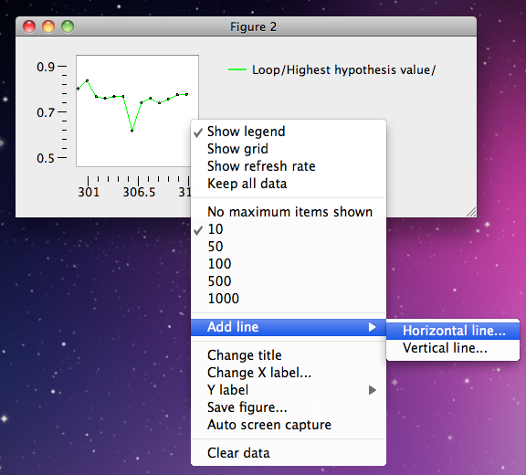
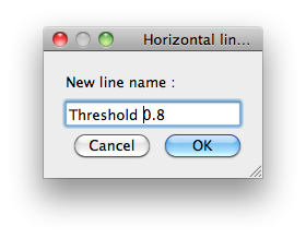
- A dialog appears and set a name for the threshold.
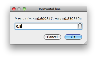
- Another dialog appears to set the value.
- The resulting figure 2.
- One last thing is about the "A posteriori PDF" panel opened at the beginning. If the detection has run for enough time, you should see a curve with some dots. A dot represents a location in the Working Memory. The dot "-1" represents the "No loop closure" hypothesis. You can select a dot (only in graphics view mode... see right-click menu) to show up the related image corresponding to this loop closure hypothesis.
