-
Notifications
You must be signed in to change notification settings - Fork 2.2k
New issue
Have a question about this project? Sign up for a free GitHub account to open an issue and contact its maintainers and the community.
By clicking “Sign up for GitHub”, you agree to our terms of service and privacy statement. We’ll occasionally send you account related emails.
Already on GitHub? Sign in to your account
Add contour map functionality #958
Comments
This is a pretty broad question. I think it needs to be reframed in terms of, what does your data look like? There are two methods of data classification for pretty much all GIS - Vector and Raster data.
They're fundamentally different types of data, each with their own strengths and weaknesses. here's some more reading on this subject. The map you posted could easily be plotted as a choropleth map if each of the bands was classified as a polygon with some sort of data classification based on which to color it. But I think in general natural science/physical geography mapping tends to use rasters more commonly.
Hope this helps! |
Hi Jason Thank for the detailed answer for my perhaps imprecise question. I have collection of semi-randomly distributed vector points for a selection of vehicles where I have (speed, latitude, longitude). I wish to make a contour map of speeds over a folium interactive map. I am not interested in any sectioning of the geografic map in municipalities, zip number or parishes, so a choropleth map is not the solution. Individual points can be also be noisy and they are not interesting by themselves. So what I was looking for was a simple way to superimpose a contour plot on a folium map. In this example a contour map is superimposed on a basemap and the underlying scattered individual points can also be seen: So I think I understand I could make the gridded contour my self and plot on top of the folium map as a raster layer, but what I was really hopping for what that there was a builtin method that just took the data and some parameters and did it automatically. :) Kind regards |
Hi Thomas, Interesting question, but as far as I know this is currently not included in folium. Would be cool to have it though! We use Leaflet under the hood, so maybe you can check if there is any Leaflet plugin that does what you want. We can than implement that plugin in folium. |
Hi Frank That's the thing. I have grown so accustomed to folium more less being able to do everything I want with very few lines of code, so I think it would make a great addition. :) I didn't find anything in the official leaflet docs, but I did find this interesting article on creating just this kind of plot in R using their leaflet wrapper. So I am guessing their code could be wrapped in a helper function in folium:
|
@tjansson60 here is what http://nbviewer.jupyter.org/gist/ocefpaf/78095b6e5d22723aae3bf05e5600e165 You'll note that we are lacking:
|
@ocefpaf Thanks for the example. |
Cool example @ocefpaf. Would be interesting to find a way to implement this in folium in a sensible way. I couldn't find any Leaflet code that does contour maps, so we're on our own. |
Yep 😄
The idea if using Regarding raster, I guess that is relatively easy to do and I'm not inclined to add a built-in support for it beyond what we already have. The issue with the legend remains though. We need to investigate how to do that properly. |
A little update from my side: I now have something working and I have written an example below to illustrate this. I hope others perhaps can use this until a real feature is available in folium. As I have written before I have grown accustomed to everything being very simple in folium, so I think a built-in contour map function would be a great addition. :) #!/usr/bin/env python
# -*- coding: utf-8 -*-
import numpy as np
import pandas as pd
import folium
import branca
from folium import plugins
import matplotlib.pyplot as plt
from scipy.interpolate import griddata
import geojsoncontour
import scipy as sp
import scipy.ndimage
# Setup
temp_mean = 12
temp_std = 2
debug = False
# Setup colormap
colors = ['#d7191c', '#fdae61', '#ffffbf', '#abdda4', '#2b83ba']
vmin = temp_mean - 2 * temp_std
vmax = temp_mean + 2 * temp_std
levels = len(colors)
cm = branca.colormap.LinearColormap(colors, vmin=vmin, vmax=vmax).to_step(levels)
# Create a dataframe with fake data
df = pd.DataFrame({
'longitude': np.random.normal(11.84, 0.15, 1000),
'latitude': np.random.normal(55.55, 0.15, 1000),
'temperature': np.random.normal(temp_mean, temp_std, 1000)})
# The original data
x_orig = np.asarray(df.longitude.tolist())
y_orig = np.asarray(df.latitude.tolist())
z_orig = np.asarray(df.temperature.tolist())
# Make a grid
x_arr = np.linspace(np.min(x_orig), np.max(x_orig), 500)
y_arr = np.linspace(np.min(y_orig), np.max(y_orig), 500)
x_mesh, y_mesh = np.meshgrid(x_arr, y_arr)
# Grid the values
z_mesh = griddata((x_orig, y_orig), z_orig, (x_mesh, y_mesh), method='linear')
# Gaussian filter the grid to make it smoother
sigma = [5, 5]
z_mesh = sp.ndimage.filters.gaussian_filter(z_mesh, sigma, mode='constant')
# Create the contour
contourf = plt.contourf(x_mesh, y_mesh, z_mesh, levels, alpha=0.5, colors=colors, linestyles='None', vmin=vmin, vmax=vmax)
# Convert matplotlib contourf to geojson
geojson = geojsoncontour.contourf_to_geojson(
contourf=contourf,
min_angle_deg=3.0,
ndigits=5,
stroke_width=1,
fill_opacity=0.5)
# Set up the folium plot
geomap = folium.Map([df.latitude.mean(), df.longitude.mean()], zoom_start=10, tiles="cartodbpositron")
# Plot the contour plot on folium
folium.GeoJson(
geojson,
style_function=lambda x: {
'color': x['properties']['stroke'],
'weight': x['properties']['stroke-width'],
'fillColor': x['properties']['fill'],
'opacity': 0.6,
}).add_to(geomap)
# Add the colormap to the folium map
cm.caption = 'Temperature'
geomap.add_child(cm)
# Fullscreen mode
plugins.Fullscreen(position='topright', force_separate_button=True).add_to(geomap)
# Plot the data
geomap.save(f'data/folium_contour_temperature_map.html') |
I suggest to transform your 2d grib data to tiles. Than you could load the data as a tile layer to your map. This is much faster than plotting geojson data or similar to the map. |
Hey @meteoDaniel , how would you go about doing what you mentioned in your last comment? |
hello all, And a lot of points are "out" of the right level... Thats the code i used: def plotHeatMap(df):
print("=== Plotting data")
# Prepare Map
# Remove nulls
df = df[df.latitude.notnull()]
df = df[df.longitude.notnull()]
df = df[df.roomGrossPrice.notnull()]
# remove outliers
q_hi = df["roomGrossPrice"].quantile(0.99)
df = df[(df["roomGrossPrice"] < q_hi)]
x_start = (df['latitude'].max() + df['latitude'].min()) / 2
y_start = (df['longitude'].max() + df['longitude'].min()) / 2
start_coord = (x_start, y_start)
# Setup colormap
colors = ['#147d05', '#1ead0a', '#ffff17', '#f28e2c', '#b30003']
vmin = df["roomGrossPrice"].min()
vmax = df["roomGrossPrice"].max()
levels = len(colors)
cm = branca.colormap.LinearColormap(colors, vmin=vmin, vmax=vmax).to_step(levels)
map = folium.Map(location=start_coord, zoom_start=14)
addContourf(map, df, colors, vmin, vmax)
for index, item in df.iterrows():
loc = tuple([item["latitude"], item["longitude"]])
folium.Circle(
location=loc,
radius=5,
fill=True,
popup="RoomPrice:<br/>" + str(item["roomGrossPrice"]) + "<br/>Rooms:<br/>" + str(item["rooms"]) + "<br/>ID:<br/>" + str(item["id"]),
color=cm(item["roomGrossPrice"]),
# fill_opacity=0.7
).add_to(map)
cm.caption = 'Room Price'
map.add_child(cm)
folium.LayerControl().add_to(map)
map.save('test.html')
print("=== Plotting data finished")
def addContourf(map, df, colors, vmin, vmax):
print("=== adding Contourf")
# The original data
x_orig = np.asarray(df.longitude.tolist())
y_orig = np.asarray(df.latitude.tolist())
z_orig = np.asarray(df['roomGrossPrice'].tolist())
# Make a grid
x_arr = np.linspace(np.min(x_orig), np.max(x_orig), 500)
y_arr = np.linspace(np.min(y_orig), np.max(y_orig), 500)
x_mesh, y_mesh = np.meshgrid(x_arr, y_arr)
# Grid the values
z_mesh = griddata((x_orig, y_orig), z_orig, (x_mesh, y_mesh), method='linear')
# Gaussian filter the grid to make it smoother
sigma = [4, 4]
z_mesh = ndimage.filters.gaussian_filter(z_mesh, sigma, mode='constant')
# Create the contour
contourf = plt.contourf(x_mesh, y_mesh, z_mesh, len(colors), alpha=0.5, colors=colors, linestyles='None', vmin=vmin, vmax=vmax)
# Convert matplotlib contourf to geojson
geojson = geojsoncontour.contourf_to_geojson(
contourf=contourf,
min_angle_deg=3.0,
ndigits=5,
stroke_width=1,
fill_opacity=0.5)
# Plot the contour plot on folium
folium.GeoJson(
geojson,
style_function=lambda x: {
'color': x['properties']['stroke'],
'weight': x['properties']['stroke-width'],
'fillColor': x['properties']['fill'],
'opacity': 0.6,
}).add_to(map)
print("=== adding Contourf finished") I already played a bit with the Gaussian filter and different interpolations methods...but somehow no outcome which you would trust so far :/ Has anybody any idea? Or even a better viz method? |
Dear all
I would like to make a map of weather-like data as temperature or pressure on a folium map similar to the plot below (from https://cdoovision.com/us-temperature-contour-map/):

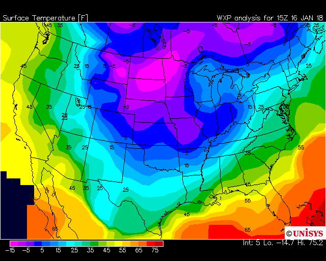
As it can be seen it is not a choropleth map as the contours go through the states and it is not a heatmap as I do not care how many measurements underlies this. The data I have is not gridded, but I have many individual measurements semi-randomly scattered over a large area.
Is this possible in folium currently in any way?
The text was updated successfully, but these errors were encountered: