Skip to content
New issue

Have a question about this project? Sign up for a free GitHub account to open an issue and contact its maintainers and the community.

By clicking “Sign up for GitHub”, you agree to our terms of service and privacy statement. We’ll occasionally send you account related emails.

Already on GitHub? Sign in to your account

[wizardlayout] support any button type #477

Open
wants to merge 3 commits into
base: master
Choose a base branch
from

Conversation

prime-time
Copy link
Contributor

Overview:
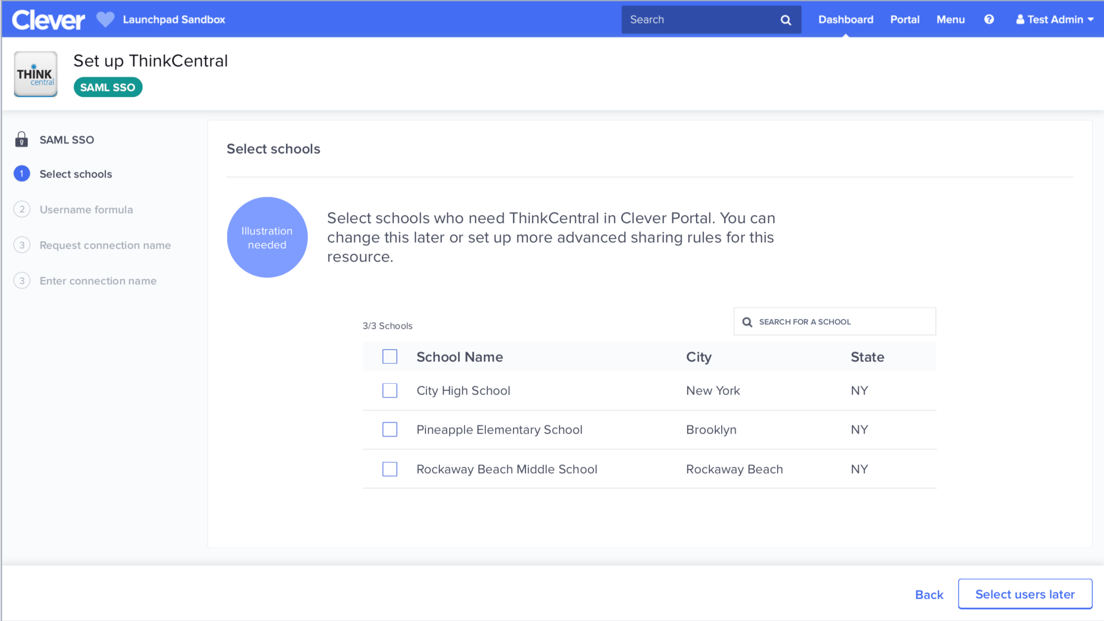
This change lets us use any button type for the WizardLayout's next button. I saw a couple of cases in some of our design mocks where the secondary button type is used. I'm not sure if we'd ever actually use the other button types, but they'll be there if we want them.

Screenshots/GIFs:
Here's an example of a design mock that uses a secondary button type for the next button.

Testing:

  • Unit tests
  • Manual tests:
    • Chrome
    • Safari
    • IE10

Roll Out:

  • Before merging:
    • Updated docs
    • Bumped version in package.json
      • Breaking change? Run npm version major
      • New component or backward-compatible component feature change? Run npm version minor
      • Only changing documentation? All good. Skip this step.
    • After creating a new component, make sure to add it to the Components List in ComponentsView.jsx. To do so:
      • Add an entry in ComponentsView.componentsToDisplay using this template:
        {
          componentLink: "<COMPONENT LINK>",
          componentImg: "<COMPONENT LINK>.png",
          componentName: "<COMPONENT NAME>",
          componentImgAlt: "A <COMPONENT NAME> component",
        },
        
      • Add a screenshot of the component in docs/assets/img with the format <COMPONENT LINK>.png
  • After merging:
    • Deployed updated docs (make deploy-docs)

@josh-clever
Copy link

Instead of adding another prop here, I would consider inversion of control https://kentcdodds.com/blog/inversion-of-control

Copy link

@josh-clever josh-clever left a comment

Choose a reason for hiding this comment

The reason will be displayed to describe this comment to others. Learn more.

Not going to block on the extra prop, but I think it would be interesting to explore a solution where we don't have to add an extra prop.

@prime-time
Copy link
Contributor Author

Instead of adding another prop here, I would consider inversion of control https://kentcdodds.com/blog/inversion-of-control

Thanks for sharing that article. I agree that adding an extra prop isn't the ideal solution. If we applied the principles from the article, we could have say a primaryButton prop that takes in a button element: <Button type="primary" value="something" />, or maybe we could let the client pass in the entire footer.

I might not need this change, so I may close this pull request, but it's good to think about how we might make the API more flexible for the future.

Sign up for free to join this conversation on GitHub. Already have an account? Sign in to comment
Labels
None yet
Projects
None yet
Development

Successfully merging this pull request may close these issues.

3 participants