-
Notifications
You must be signed in to change notification settings - Fork 37
Home
Components similar to Delphi VCL Buttons, Toolbar, DbNavigator, BindNavigator, ButtonGroup and CategoryButtons with Custom Graphic Styles, and an advanced, full-customizable TaskDialog, also with animations!
StyledComponents is a set of VCL components for Delphi (32 and 64 bit) that allow you to overcome the limits imposed by standard VCL components, maintaining 100% compatibility of the properties.
You can easily use them, as a replacement for the standard ones, as well as to provide new features.
The main limitations of the buttons and components of the VCL are the shape and color, defined by the operating system.
With StyledComponents you can overcome these limits in a simple way. You can:
- Control the shape of the button
- Control button and border color (without limits) for every button state.
- Use "families" of predefined styles as in the WEB environment (e.g. Angular or Bootstrap)
- Adapt to the colors of the VCL styles, keeping the shape of the button consistent
- The appearance is identical in “Windows” mode or by applying VCL styles to the application
Last, but not least, with StyledTaskDialog you can control appearance of your Message Dialogs in any aspect. Using Skia4Delphi you can also add animated Icons to your messages.
…all available from the Delphi XE6 version (which allows the use of GDI+, used for button drawing).
using only few properties you can setup your Button in a very simple way.
With three values, you can select predefined ready styles for button color, border and font color:
- StyleFamily: the "Family" of a Style (eg.Classic or Bootstrap or Angular)
- StyleClass: a collection of predefined button style of the selected Family
- Style Appearance: eg.Normal or Outline
- StyleDrawType
btRoundRect (default) |
btRect |
btRounded |
btEllipse |
|---|---|---|---|
 |
 |
 |
 |
- StyleRoundedCorners: used for RoundRect and Rounded DrawType
- StyleRadius: used for btRoundRect DrawType
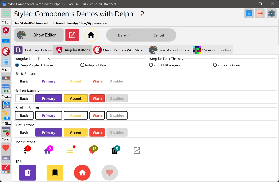
In this picture you can see the StyledComponentsDemo application with some examples:
StyledComponents offers more options then standard components, such as:
- Down, AllowUp and GroupIndex to use them in "group"
- Caption alignment (left, centered, right)
- Presence of Captions (with alignment) and customizable icons via ImageList in TStyledDBNavigator and TStyledBindNavigator
- Ability to change icon position and caption alignment in TStyledButtonGroup and TStyledCategoryButtons
- Different appearance for buttons Items of TStyledToolbar, TStyledButtonGroup and TStyledCategoryButtons
- Notification Badge for all StyledButtons
- AutoClick event (after a Delayed time)
- Animated icons using, TStyledAnimatedButton
…finally, a component for Dialogs is available, completely customizable, which uses custom images or animations and StyledButtons within it, to be 100% consistent with the rest of the application.
Notice: by default the cursor for all Styled Buttons is crHandPoint.
| Component | Description |
|---|---|
 |
TStyledGraphicButton is a "pure" Graphic Button with Styles (eg. Classic, Bootstrap, Angular, Basic-Color, SVG-Color) with support of ImageList, Action and full configuration of five states: Normal, Pressed, Selected, Hot and Disabled. You can use it also into a TVirtualList component. |
 |
TStyledButton is classic "button control" with Styles (eg. Classic, Bootstrap, Angular, Basic-Color, SVG-Color) with support of ImageList, Action and full configuration of five states: Normal, Pressed, Selected, Hot and Disabled, plus Focus and TabStop support. You can easily replace all of your TButton components. |
 |
TStyledToolbar is a Toolbar that uses StyledToolButton, with full customizable of every button style and full control over the size of the buttons, also when Captions are visible. The width and height of the StyledToolButtons inside, do not depends on Caption size, as in classic TToolBar. |
 |
TStyledDbNavigator is a special "DbNavigator" component, with Styles (eg. Classic, Bootstrap, Angular, Basic-Color, SVG-Color), plus Button captions and better "move" icons in vertical mode. |
 |
TStyledBindNavigator is a special "BindNavigator" component, with Styles (eg. Classic, Bootstrap, Angular, Basic-Color, SVG-Color), plus Button captions and better "move" icons in vertical mode. |
 |
TStyledButtonGroup is a special "ButtonGroup" component with Styles (eg. Classic, Bootstrap, Angular, Basic-Color, SVG-Color) plus ImagePosition, CaptionAlignment and Flat properties, for adding more controls to the appearance of Buttons. |
 |
TStyledCategoryButtons is a special "CategoryButtons" component with Styles (eg. Classic, Bootstrap, Angular, Basic-Color, SVG-Color) plus ImagePosition, CaptionAlignment and Flat properties, for adding more controls to the appearance of Buttons. |
 |
TStyledTaskDialog is a special "TaskDialog" component (to replace MessageDlg and TaskDlg) with custom Button Captions and Icons. Using a special Form you can show a full customizable Dialog. Using Skia4Delpghi you can show animated dialogs! |
For "backward compatibily", you can also use those components.
| Component | Description |
|---|---|
 |
TStyledSpeedButton derives from TStyledGraphicButton, and introduce Layout, Margin and Spacing properties, to control Drawing (Icon and Caption) as a standard TSpeedButton. You can also use Glyph and NumGlyphs. |
 |
TStyledBitBtn derives from TStyledButton, and introduce Layout, Margin and Spacing properties, to control Drawing (Icon and Caption) as a standard TBitBtn. You can also use Glyph and NumGlyphs. |
Those components uses some properties to Draw Icon and Caption in a different way:
- A Glyph and NumGlyphs for the Icon of the button (not reccomended, because doesn't scale)
- The position of the caption, using ButtonLayout instead and Margin (instead of ImageAlignment and ImageMargins)
- The space between the Icon and the Caption, defined by spacing.
| Component | Description |
|---|---|
 |
TStyledAnimatedButton is Styled Button with with "animated icon" using a Skia TSkAnimatedImage component inside. You can select the events that starts the animation, like: AnimateOnMouseOver, AnimateOnClick, AnimateAlways, AnimateOnFocus. |
Open the package group Vcl.StyledComponents.groupproj from the correct folder of your Delphi version (eg. \StyledComponents\Packages\D12).
Then build the run-time package: StyledComponentsXXX and install the design-time package: dclStyledComponentsXXX.
Remember to add the "{Folder}\StyledComponents\source" path to use the components in your application or the library path "{Folder}\StyledComponents\Lib\DXX\WinXX\Release"
If you want to use also the Animated Components, you need Skia4Delphi previously installed in your IDE (In Delphi 12 it's already installed).
Open the package group Vcl.StyledAnimatedComponents.groupproj from the correct folder of your Delphi version (eg. \StyledComponents\Packages\D12).
Then build the run-time package: StyledAnimatedComponentsXXX and install the design-time package: dclStyledAnimatedComponentsXXX.
if you need package for other Delphi version not included (newer than XE6) please add a new Issue
TStyledGraphicButton, TStyledButton, TStyledBitBtn and TStyledSpeedButton are designed to expand Button UI styles to break the limits of classic VCL Button components.
The Button Styles defined are not affected by VCLStyles and are also visibile on a "non styled" Windows application, so you can have more than a single Button styled also using VCLStyles.
You can build Rectangular, Rounded or RoundRect or Ellipsis/Circle button as you prefer.
using only three elements you can setup your Button in a very simple way:
- StyleFamily: the main attribute for Styled Button
- StyleClass: a collection of predefined button style
- Style Appearance: eg.Normal or Outline
Component editor for TStyledGraphicButton and StyledButton:
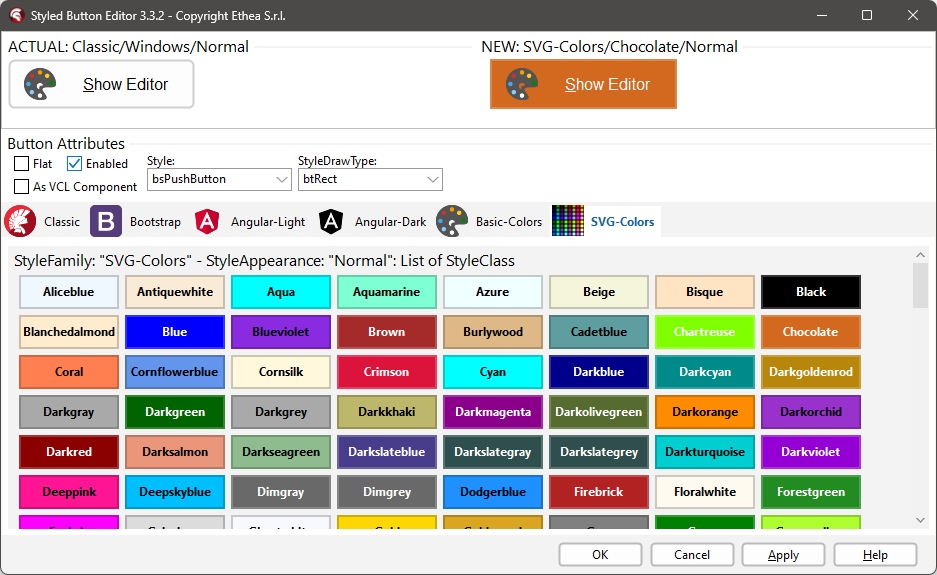
To simplify use of the Styled Buttons, there is a useful "Component Editor" to select three values that defines Button Style:
List of available StyleFamily
- Classic: a collection of Styles similar to VCLStyled TButton
- Bootstrap: a collection of Styles similar to Bootstrap buttons
- Angular-Light: a collection of styles similar to Angular buttons
- Angular-Dark: a collection of styles similar to Angular buttons
- Basic-Color: a collection of styles based to Delphi "normal" and "System" Color collection
- SVG-Color: a collection of styles based to Delphi "AlphaColors" Color collection
Control the default rendering styles for any Styled Buttons, Toolbars and DbNavigator
It's possible to redefine at global application level the default Drawing styles for any Components, adding some line in your project file. For Example:
Add those units in uses of dpr:
  Vcl.StyledButton,
  Vcl.ButtonStylesAttributes,
  Vcl.StyledDbNavigator,
  Vcl.StyledToolbar,
Add those lines after Application.Initialize in dpr code:
  TStyledButton.RegisterDefaultRenderingStyle(btRounded);
  TStyledDbNavigator.RegisterDefaultRenderingStyle(btRounded);
  TStyledToolbar.RegisterDefaultRenderingStyle(btRect);
You can also use a Family/Class/Appearance of any type, for example:
TStyledButton.RegisterDefaultRenderingStyle(btRoundRect, BOOTSTRAP_FAMILY, btn_primary, BOOTSTRAP_NORMAL);You can also use Interposer Unit (Vcl.StyledComponentsHooks.pas) to easily change all Buttons of your application.
Template unit to create your custom Family Styles
With the unit "Vcl.TemplateButtonStyles.pas" you can create your own Family of Button Styles, as explained here
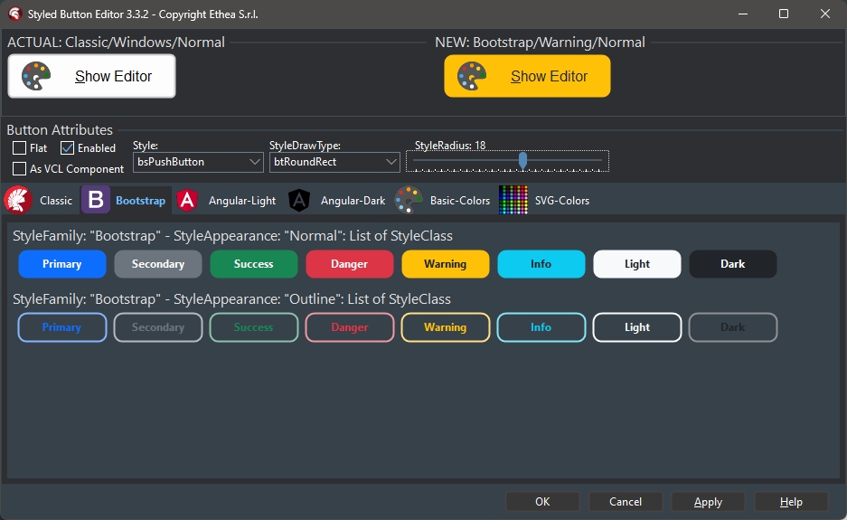
The Component Editor, with selected Family "Boostrap" and StyleRadius 18: Style Appearance can be Normal or Outline
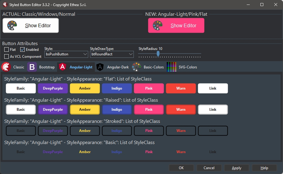
The Component Editor, with selected Family "Angular Light": Style Appearance can be Flat, Raised, Basic, Stroked
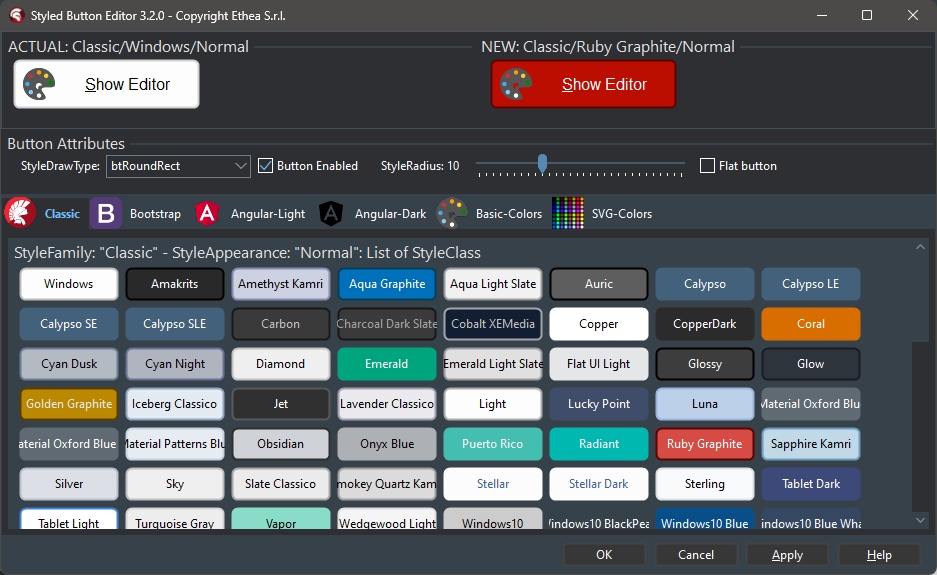
The Component Editor, with selected Family "Classic": Style Appearance can be Normal or Outline
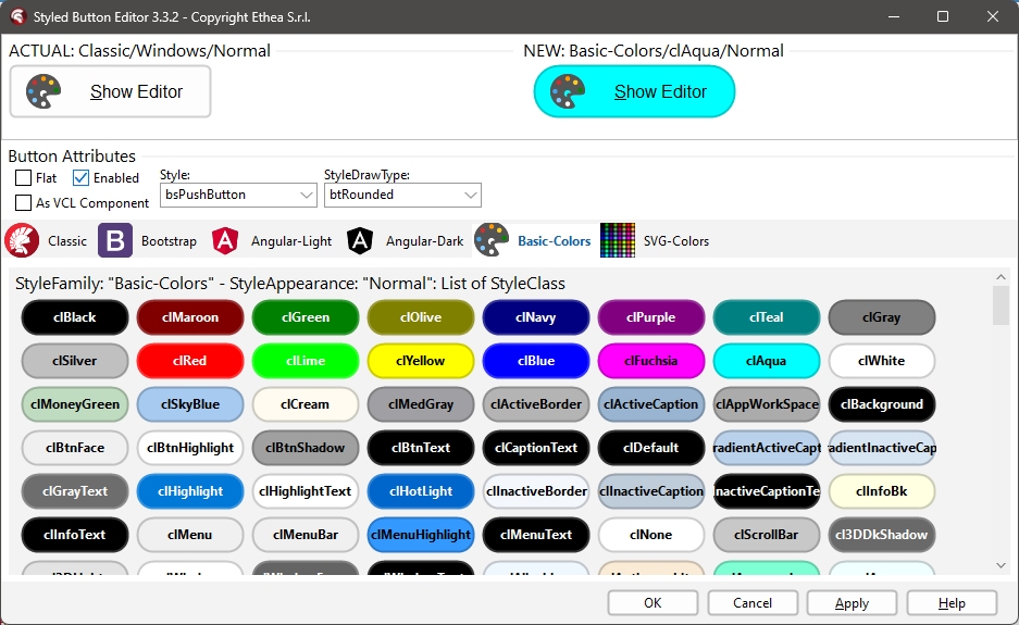
The Component Editor, with selected Family "Basic-Colors", and Rounded StyleDrawType: Style Appearance can be Normal and Outline
The Component Editor, with selected Family "SVG-Color", Style Appearance can be Normal or Outline
Special Features
Styled Components has special features compared to classic VCL Controls.
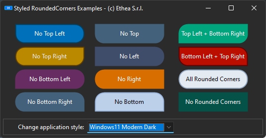
RoundedCorners options
You can define RoundedCorners property, to enable/disable Rounding drawing, as showed in this example:
Notification Badge for buttons
All styled Buttons can show NotificationBadge above them, with custom label/color and shape.

Read Notification Badge guide to explorer how it works...
AutoClick/AutoClickDelay for buttons
You can activate the AutoClick flag to invoke the Click event of the StyledButton, after a AutoClickDelay time, as showed in the AutoClick Demo:
Also the StyledTaskdialog can use this function to AutoClick and close the Dialog.
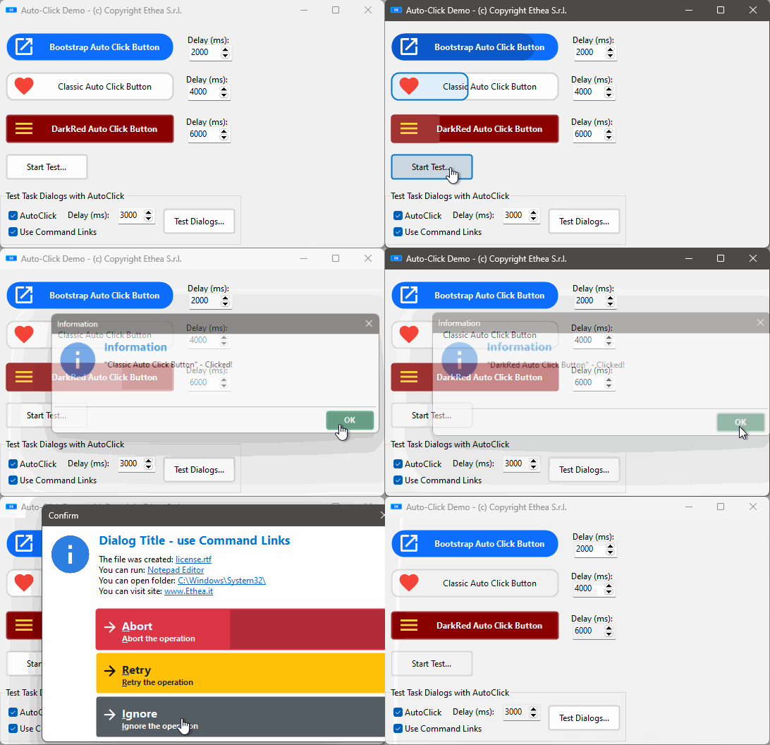
Read AutoClick/Delay guide to explorer how it works...
Rounded Button Style
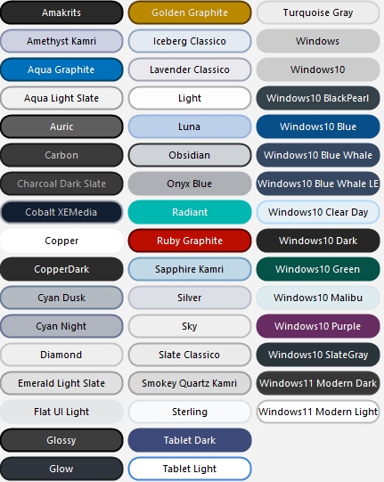
_In this picture an example of "full-rounded" buttons applyed to all "VCL-Styled" buttons: a feature not available in VCL Styled buttons.
- Style Button Examples
- Styled Toolbar Examples
- Styled DbNavigator Examples
- Styled TaskDialog Examples
- Styled Animated Buttons Examples
- StyledRounded Corners Demo
Licensed under the Apache License, Version 2.0, (the "License")

