- Web Accessibility
- Table of Contents
- Introduction
- Why Web Accessibility
- Types of Disabilities
- Tools:
- Usability
- Standards and Regulations
- References
- ADA
- ARIA
- HTML
- Custom Elements and Shadow DOM
- Forms
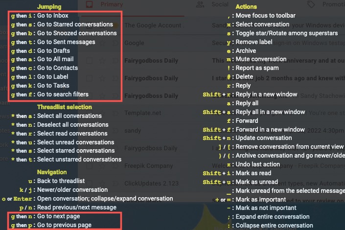
- Keyboard Shortcuts
- Keyboard focus vs Visual focus
- Focus and Hover Styles
- Tab Index
- WYSIWYG Editors
- Web Accessibility Initiative—Accessible Rich Internet Applications (WAI-ARIA)
- Roles
- States and Properties
- Live Regions
- ARIA Support
- Landmarks
- Main Navigation Landmark Example:
- Breadcrumb Navigation Example:
- Local Navigation Example:
- Label landmarks
- Performance
Web Accessibility is the practice of ensuring that people with disabilities can perceive, understand, navigate, and interact with the web. It is about making the web accessible to everyone, regardless of their abilities. It is about making the web inclusive.
- Legal Requirement: In many countries, it is a legal requirement to make the web accessible. For example, in the United States, the Americans with Disabilities Act (ADA) requires that public and private organizations make their websites accessible to people with disabilities.
- Ethical Requirement: It is the right thing to do. The web is a public space. It should be accessible to everyone.
- Business Requirement: Making the web accessible can increase the audience for the website. It can also improve the search engine ranking of the website. It can also improve the user experience of the website. For example, making the web accessible can improve the user experience for people with low vision, people with motor disabilities, and people with cognitive disabilities.
- Visual Impairment: People with low vision, people with color blindness, people with total blindness.
- Hearing Impairment: People with hearing loss, people who are deaf.
- Motor Disabilities: People with limited mobility, people with tremors, people with paralysis.
- Cognitive Disabilities: People with learning disabilities, people with memory loss, people with attention deficit disorder.
- Speech Disabilities: People with speech impairments, people who are mute.
- Seizure Disorders: People with epilepsy, people with photosensitive epilepsy.
- Aging: People with age related disabilities, people with age related impairments.
- https://wave.webaim.org/
- https://www.nvaccess.org
- CSS less mode in browser
- Screen Readers (Voice Over in Mac)
- ct.css is a little diagnostic snippet, named after Computed Tomography (CT) scans, that exposes potential performance issues in your page’s tags, and will disappear as soon as you’ve fixed them. https://csswizardry.com/ct/
- Accessibility features of Next.js
- Log A11y Error on Browser Console on Next.js/React.JS
- Axe accessibility testing tools
- Google Lighthouse 10.ARC Toolkit
- IBM Accessibility Checker NodeJS
- IBM Accessibility Checker Tools
- Emulators provided by rendering tab in Chrome DevTools. For example:

- Avoid using technical language/jargon in text. Keep it as simple as possible.
- Plain language is good usability (avoid technical Jargon if possible)
- Character sets and Fonts should be chosen so that they contain all the characters that are used in the language.
- For Audio and Video, subtitles, captions or transcripts should be provided. Use case: Noisy Places, Deaf people, people with hearing loss, people who are not fluent in the language spoken in the videos.
- All foreground and background colors should have sufficient contrast, making it easier for people with low vision to read the content.
- Keyboard/Screen Reader Navigation should be possible.
The Web Content Accessibility Guidelines (WCAG) are a set of international standards that define how to make web content more accessible to people with disabilities. They are developed by the World Wide Web Consortium (W3C).
WCAG covers a wide range of disabilities, including visual, auditory, physical, speech, cognitive, language, learning, and neurological disabilities.
The guidelines are based on four principles, often referred to by the acronym POUR:
Perceivable: Information and user interface components must be presentable to users in ways they can perceive.
Operable: User interface components and navigation must be operable.
Understandable: User interface and information must be understandable.
Robust: Content must be robust enough that it can be interpreted reliably by a wide variety of user agents, including assistive technologies.
WCAG has three levels of conformance: A, AA, and AAA. Level A is the minimum level of conformance, while AAA is the highest.
WCAG is important because it helps to ensure that people with disabilities have equal access to web content. It also helps to improve the usability of web content for everyone.
Some key aspects of WCAG include:
Text alternatives for non-text content: This includes images, videos, and audio content.
Captions and transcripts for audio and video content: This makes audio and video content accessible to people with hearing disabilities:
- Videos should have closed captions and a transcript
- If videos have a play/pause toggle button the aria-label should be updated and describe the video being played/paused
Keyboard accessibility: This ensures that people who cannot use a mouse can still navigate and use web content.
- No keyboard traps: the tab navigation should never get blocked by an element "trapping" the navigation shortcuts.
Sufficient color contrast: This makes it easier for people with low vision to read text and see images. Clear and consistent navigation: This makes it easier for everyone to find their way around a website.
WCAG 1.0: This was the original version, released in 1999. It primarily focused on HTML and is no longer recommended for use.
WCAG 2.0: Released in 2008, this version introduced the POUR principles (Perceivable, Operable, Understandable, and Robust) and provided more technology-agnostic guidelines.
WCAG 2.1: This version, released in 2018, built upon WCAG 2.0 and addressed the growing use of mobile devices and assistive technologies. It included new success criteria to improve accessibility for people with low vision, cognitive, and learning disabilities.
WCAG 2.2: The latest version, released in 2023, adds further success criteria to improve accessibility for people with cognitive, low vision, and motor disabilities.
References:
WCAG Checklist WCAG Cheatsheet
The European Accessibility Act (EAA) is impacting digital accessibility in Europe effective early 2025. While not explicitly requested it is safe to say that organizations will need to comply with WCAG (likely 2.1 or later) to meet the EAA requirements.
https://almanac.httparchive.org/en/2022/accessibility
https://webaim.org/blog/the-ada-and-the-web-concerns-and-misconceptions/
https://developer.mozilla.org/en-US/docs/Web/Accessibility/ARIA
<html lang="en">
- The lang attribute is used to specify the primary language for the document. It is important for screen readers to announce the content in the correct language. Lacking the lang attribute, screen readers will assume the language based on the user's settings. This can lead to incorrect pronunciation of words and phrases, bad translations, and other formatting issues.
- Lang attribute can be used on the html tag, or on the specific elements like p, h1, etc.
  <p lang="en">
    The Alchemist is a novel written by Brazilian author <span lang="es">
    Paulo Coelho</span>, originally published in Portuguese in 1988.
  </p>
- Screen readers that support multiple languages adapt their pronounciation and accent based on the lang attribute. A page with German content but lang set to "en" could end up being pronounced in English accent which could result into hard to understand pronounciation (or even wrong).
- Certain tags like
<q>behave differently based on the lang attribute. For example, in English, quotes are represented by double quotes. In French, quotes are represented by guillemets. The lang attribute helps the browser to render the quotes correctly.
  <p lang="en">
    <q>quotes are represented as</q>
  </p>
<!-- Results in: “quotes are represented as” --> <p lang="en">
<q>les citations sont représentées comme</q>
</p>
<!-- Results in: „les citations sont représentées comme“ -->- Browser may select language specific fonts based on the lang attribute.
- SEO: lang attribute could also help search engines understand content better.
<title>of page must be unique and should describe the content of the page. It is the first thing that screen readers announce when the page is loaded. It is also used by search engines to understand the content of the page.- Additionally, opengraph meta tag can be used to include catchier title for social media previews.
  <head>
    <title>Web Accessibility</title>
    <meta property="og:title" content="Web Accessibility - A Comprehensive Guide">
</head>- Screen reader users often use shortcut keys to anounce the title of the page. So, even for SPA's where the title does not change, it is important to update the title when the content changes.
- Titles becomes labels for bookmarks.
- Titles should be unique, concise and should contain relevant information first. For ex: "Website Name: Page Name" is a bad practice. "Page Name - Website Name" is a better practice.
- Titles should be less than 60 characters. This is because search engines truncate titles longer than 60 characters.
- Additional context can be provided for example if a page is part of flow, then title could include step number and step description.
- Viewport is the rectangular area in which root element
<html>is contained. - Users with low vision often use zoom to increase the size of the content. If viewport meta tag settings don't allow zooming, then it could be difficult for users with low vision to read the content.
<meta name="viewport" content="width=device-width, initial-scale=1">- Avoid using restrictive viewport settings like
user-scalable=nooruser-scalable=0. - Setting
width=device-widthensures that the content fits the screen width. Avoid using hardcoded/fixed width settings, as it could cause overflow problems if the screen width is smaller than the fixed width. maximum-scaleandminimum-scalecan be used to limit the zooming. However, it is better to avoid using these settings. Users with low vision might need to zoom in more than the maximum-scale setting.
- Sensible usage of heading tags to organise content. Heading h1,h2,h3.. describes structure of content to screen readers. Without hierarchy, it would take longer to navigate through the content or locate the desired information.
- Example:
  <h1>Toy Store</h1>
  <h2>Toys</h2>
  <h3>Plush Toys</h3>
  <h3>Wooden Toys</h3>
  <h3>Electronic Toys</h3>
  <h3>Oudoor Toys</h3>
  <h2>Books<h2>
  <h2>Gift Cards</h2>
<h2>Contact Us</h2>- Headings are considered as most important elements in establishing the hierarchy of the content.
- As per this survey: https://webaim.org/projects/screenreadersurvey10/#finding, 71.6% of screen reader users use headings to navigate the page.
- Screen readers also allow users to navigate through headings. For example, in NVDA, users can press H to navigate to the next heading, and Shift + H to navigate to the previous heading. 1-6 can be used to navigate to specific level of heading. Ins + F7 can be used to list all headings on the page.
- Sccreen readers announce the heading level along with the heading text. For example, "Heading 1: Toy Store", "Heading 2: Toys", "Heading 3: Plush Toys", etc. Thats why it is important to keep a sane hierarchy of headings. h1s tell the user what the page is about, h2s tell the user what the sections are about, h3s tell the user what the subsections are about, and so on.
- Skipping heading levels is a bad practice. For example, using h3 directly after h1 is a bad practice. It is confusing.
- Use lists to organize content. It helps to divide text into smaller chunks, and easier for screen readers to skip one line item to another by just reading the first few words of each item.
- ul - unordered list, screen readers will usually announce "bullet list" or "list of items"
- ol - ordered list, screen readers will usually announce "numbered list" or "list of items" or the number of list item.
- Screen readers announce the type of list and the number of items in the list. For example, "bullet list with 3 items" or "numbered list with 3 items".
- Links should be used to navigate to a different page or a different section of the same page.
- Buttons are used to perform an action like form submit or run some Javascript code.
<a>element has a semantic "link" role which screen readers explicitly announce alongside the text.
- Must read => Better Link Labels: 4Ss for Encouraging Clicks
- Link's text should communicate clearly to the users what they will find on the target page. For example, "Click here", "Learn more", "Read more", "More info", etc. are bad link texts. They are vague and make it difficult for users to anticipate what they will find if they click it. Such links have Low Information scent and users are lesss likely to click them.
- Link label is supposed to be a succinct yet accurate description of what the page is about. If this description feels relevant to the user’s goal, the link will have high information scent for that user and her task, and she will be likely to click it.
- Avoid using Jargon/Technical words in labels as everyone might not understand them.
- Summary text along with Link (if any) should be accurate and must convey gist of what the target page contains.
- The image associated with a link should always be descriptive and representative for the page content or for the category it stands for. Avoid using generic or misleading images.
- A link is a promise. To function properly, it must set expectations that are not only specific, but also accurate. When links set expectations that aren’t met, they slowly corrode the user’s trust in the site and the organization it represents. Wasted clicks rapidly make users cut their click budget for your site or even leave your site.
- Majority of web users scan instead of reading through the page entirely. Research shows that links styled differently than static text around it are likely to draw more attention. So, Links should be styled differenly than regular text. And their label should be sufficient to explain the target page without the need to read the supporting/surrounding text (because there is high probablilty that users would not read that).
- Imagine a screen reader announcing "Click here, link" to a user having vision disability. Without any context it is not possible to determine where that link would take the user and/or if it would fulfill the objective in user's mind.
- Must read => Creating a perfect link
<button>Toggle Picture</button>element has implicit ARIA button role. So, its best to use this element for a button. Screen readers annouce button role along with the text. Ex: "Toggle Picture, button".- Label/text for a button must be present and must be accurate (not misleading) so that screen readers can announce their purpose.
- In following case, label for button is coming from "alt" text of image:
<button type="button">
  <img src="/images/download.svg" alt="Download" width="26">
</button>
- If you want to hide image from accessibility tree, use "aria-hidden" = true or remove "alt" text of the image:
  <button type="button">
    Save
    <img src="/images/download.svg" alt="" width="26">
  </button>
  <!-- OR -->
  <button type="button">
    Save
    <svg aria-hidden="true" viewBox="0 0 39 44" width="26">
      <path d="M19.5 36.5 1.6 26.1v-3.6l16.3 9.4V1.5h3.2v30.4l16.3-9.4v3.6z"/>
      <path d="M1 41.5h37" style="stroke:#000;stroke-width:3;"/>
    </svg>
  </button>
- If you have just icon as button, then you can hide the label via CSS (or use aria-label) and remove alt text so that it works for both visual and reader mode.
- If you have a button with just an icon, then you can use aria-label to provide a label for the button. For example:
  <button type="button" aria-label="Download">
    <img src="/images/download.svg" alt="" width="26">
  </button>
  <!-- OR -->
  <button type="button">
    <span class="visually-hidden">Download</span>
    <img src="/images/download.svg" alt="" width="26">
  </button>
- If you don't want
<button>to look like a button, then remove its default properties using CSS. One of the most common accessibility issues on most websites is fake buttons created using divs/images.button { background: none; border: 0.1em solid transparent; 1 font: inherit; padding: 0; }
- Many developers assume that if a control doesn’t look like a button, it doesn’t have to be a
<button>element. Their reasoning is: If there are no button styles in the first place, you don’t have to remove them. - Fake buttons lack keyboard focus, and they don’t announce themselves as buttons to screen readers. This makes them inaccessible to keyboard and screen reader users. Space and Enter keys are the most common keys used to activate buttons. If a control doesn’t have keyboard focus, it can’t be activated using these keys.
- When a button is used to control state of other elements on page, for example button opening/closing a nav, then use
aria-expanded=true/falseto communicate if nav is visible. Using JS, toggle the state of attribute so that it can be announced appropriately. - Other example properties that communicate state or association with other element: aria-haspopup, aria-checked, aria-pressed
- Section element represents a region on page that groups content on basis of theme.
- It should start with a heading element (h1-h6) to provide a heading for the section.
- An unlabelled section is semantically equal to a div. Div is a generic container, section is a thematic container. Example:
  <section aria-label="Product Search">
    <h2> Product Search </h2>
    <!-- Search form/filters -->
    <!-- Search results -->
</section>- A div equivalent of this would be:
  <div aria-label="Product Search" role="section">
    <h2> Product Search </h2>
    <!-- Search form/filters -->
    <!-- Search results -->
</div>- Asides element represents a section of the page that is tangentially related to the content around it. It is often used for sidebars, pull quotes, glossaries, etc.
- It should start with a heading element (h1-h6) to provide a heading for the aside.
- An unlabelled aside is semantically equal to a div. Example:
  <aside aria-label="Related Products">
    <h2> Related Products </h2>
    <!-- List of related products -->
</aside>- Implicit role of aside is complementary. It is used to provide additional information that is complementary to the main content.
- Article element represents a self-contained piece of content that could be distributed and reused independently. It could be a blog post, a news article, a forum post, etc.
- A comment could be a nested article withing a blog post article. Since comment is a self contained piece of content.
- A Product listed, an interactive widget, a recipe, a blog post, a news article, a forum post, etc. are all examples of articles.
- It should start with a heading element (h1-h6) to provide a heading for the article.
- An unlabelled article is semantically equal to a div. So, always try to put meaningfule heading and label for article. Example:
  <article aria-label="Blog Post">
    <h2> Blog Post </h2>
    <!-- Blog content -->
</article>- There is a wide variety of keyboard shortcut support available in screen readers to navigate through articles.
- Use tables for tabular data (and not for layout).
- https://inclusive-components.design/data-tables/
- https://adrianroselli.com/2021/04/sortable-table-columns.html
- See Exploring A Data Table with Safari and Voiceover
- Avoid Auto-play: User-initiated navigation is preferred.
- Clear Controls: Visible and keyboard accessible.
- Semantic HTML: Use appropriate elements.
- Alt Text for Images: Descriptive alt text.
- ARIA Attributes: Enhance accessibility for assistive technologies.
- Testing: Essential with assistive technologies.
Example:
<div class="slideshow" aria-live="polite">  <div class="slides-container">
    <div class="slide" aria-hidden="false">  <img src="image1.jpg" alt="Descriptive alt text for image 1">
      <div class="slide-content">
        <h2>Slide 1 Title</h2>
        <p>Content for slide 1.</p>
      </div>
    </div>
    <div class="slide" aria-hidden="true">  <img src="image2.jpg" alt="Descriptive alt text for image 2">
      <div class="slide-content">
        <h2>Slide 2 Title</h2>
        <p>Content for slide 2.</p>
      </div>
    </div>
    </div>

  <button class="prev-slide" aria-label="Previous Slide">Previous</button>
  <button class="next-slide" aria-label="Next Slide">Next</button>

  <div class="slide-controls">  <button aria-label="Go to slide 1"></button>
    <button aria-label="Go to slide 2"></button>
    </div>
</div>

<script>
  const slides = document.querySelectorAll('.slide');
  let currentSlide = 0;

  function showSlide(n) {
    // ... logic to hide/show slides, update aria-hidden, etc.
  }

  // Event listeners for prev/next buttons, keyboard navigation, etc.
</script>- Semantic HTML: Use appropriate elements (e.g.,
<ul>,<li>for tabs). - ARIA Attributes: Essential for conveying the tab structure and state to assistive technologies.
- Keyboard Interactions: Define clear keyboard interactions (Tab, Arrow keys, Enter/Space).
- Focus Management: Control where the keyboard focus goes after a tab is activated.
- Clear Visuals: Use CSS to style the active tab differently.
- Testing: Absolutely crucial with screen readers and keyboard-only navigation.
Example:
<div class="tabs">
  <ul role="tablist" aria-label="Tab Example">
    <li role="presentation">
      <button role="tab" id="tab1" aria-controls="panel1" aria-selected="true" tabindex="0">Tab 1</button>
    </li>
    <li role="presentation">
      <button role="tab" id="tab2" aria-controls="panel2" aria-selected="false" tabindex="-1">Tab 2</button>
    </li>
    </ul>

  <div id="panel1" role="tabpanel" aria-labelledby="tab1" tabindex="0">
    <h2>Content for Tab 1</h2>
    <p>Descriptive content for tab 1.</p>
  </div>
  <div id="panel2" role="tabpanel" aria-labelledby="tab2" aria-hidden="true" tabindex="0">
    <h2>Content for Tab 2</h2>
    <p>Descriptive content for tab 2.</p>
  </div>
  </div>

<script>
  // JavaScript to handle tab switching, ARIA updates, keyboard navigation, etc.

  const tabs = document.querySelectorAll('[role="tab"]');
  const panels = document.querySelectorAll('[role="tabpanel"]');

  tabs.forEach(tab => {
      tab.addEventListener('click', () => {
          activateTab(tab);
      });

      tab.addEventListener('keydown', (e) => {
          handleKeyboardNavigation(e, tab);
      });
  });

  function activateTab(selectedTab){
    tabs.forEach(tab => {
        tab.setAttribute('aria-selected', tab === selectedTab);
        tab.setAttribute('tabindex', tab === selectedTab ? '0' : '-1');
    });

    panels.forEach(panel => {
        const tabId = panel.getAttribute('aria-labelledby');
        panel.setAttribute('aria-hidden', tabId !== selectedTab.id);
    });
  }

  function handleKeyboardNavigation(e, currentTab){
      // ... logic for arrow key navigation, Enter/Space activation
  }

</script>- Captions/Subtitles: Use accurate, synchronized captions. WebVTT is the preferred format.
- Transcripts: Provide a text transcript of the video's audio.
- Audio Descriptions: Include audio descriptions of important visual information. These can be embedded in the video itself or provided as a separate track.
- Keyboard-Accessible Player: Use a video player that is fully keyboard accessible. Many standard video players have built-in accessibility features.
- Avoid Auto-play: Don't auto-play videos unless absolutely necessary. If you must, provide a clear and easily accessible way to stop the playback.
- Provide Controls: Ensure all necessary controls (play/pause, volume, fullscreen, etc.) are available and keyboard accessible.
- Descriptive Text: Provide descriptive text around the video embed to give context.
Example:
<div class="video-container">
  <video controls poster="video-poster.jpg">
    <source src="video.mp4" type="video/mp4">
    <source src="video.webm" type="video/webm">
    <track src="captions.vtt" kind="captions" srclang="en" label="English Captions">
    Your browser does not support the video tag.
  </video>
  <div class="video-description">
    <h2>Video Title</h2>
    <p>Descriptive text about the video content.</p>
    <a href="transcript.txt">Transcript</a>  </div>
</div>- Light DOM vs Shadow DOM: Light DOM is the default DOM that is rendered by the browser. Shadow DOM is a separate DOM that is attached to the light DOM. It is used to encapsulate the styles and behavior of the custom element. It is not accessible to the light DOM. It is used to create custom elements that are reusable and encapsulated.
- Do not mix light DOM and shadow DOM contexts. For example: a label and associated input should be in the same context. If they are in different contexts, then screen readers will not be able to associate the label with the input.
- https://nolanlawson.com/2022/11/28/shadow-dom-and-accessibility-the-trouble-with-aria/
- https://alice.pages.igalia.com/blog/how-shadow-dom-and-accessibility-are-in-conflict/
-
Avoid using Spans and Divs in place of interactive elements like buttons, links, form elements. Interactive elements carry default accessibility features, which are lost when replaced with non-interactive elements. For example, making a diive look like button would take just CSS. But making it behave or as accessible as a button would require: button role, would need to be focusable, focus styles, keyup/down event listeners. This is a lot of extra work, so why not use native button element which has all this built-in.
-
Input elements like text fields, radio buttons, checkboxes, and select menus carry default accessibility features. For example: When a radio button is focused, screen readers will announce the radio button's label and its state (checked or unchecked).
-
Labels are important for screen readers. They provide context to the form element. When a form element is focused, screen readers will announce the label. If the label is missing, screen readers will announce the placeholder attribute value.
- Labels should be placed above inputs (instead of left) https://www.uxmatters.com/mt/archives/2006/07/label-placement-in-forms.php
- Avoid placeholders https://www.nngroup.com/articles/form-design-placeholders/
- Instead of placeholders, give inline instructions within label or right after input elements.
-
Autocomplete
- https://html.spec.whatwg.org/multipage/form-control-infrastructure.html#autofilling-form-controls:-the-autocomplete-attribute
- Wherever possible and makes sense, do use autocmoplete attribute to help people with memory and motor disabilities.
-
Required fields If an input field is required, then label should clearly indicate that the field is required. Simply putting an asterisks (*) might not be enough for screen readers.
-
aria-invalid="true" can be used to indicate that the input is invalid. Screen readers will announce that the input is invalid. aria-describedby can be used to provide a description of the error. https://www.smashingmagazine.com/2023/02/guide-accessible-form-validation/
-
Label and Input should be associated using
forattribute in label andidattribute in input. This helps screen readers to announce the label when input is focused. Example:<label for="username">Username (required)</label> <input type="text" id="username" name="username">
-
Use fieldset and legend to group related elements together. Screen readers would announce the legend when the fieldset is focused. Example:
<fieldset>
  <legend>Shipping Address</legend>
  <label for="name">Name (required)</label>
  <input type="text" id="name" name="name">
  <label for="address">Address (required)</label>
  <input type="text" id="address" name="address">
</fieldset>
-
Certain inputs like radio buttons have very small interaction area. Pairing the input with the label increases the interaction area. It reduces the chances of selecting the wrong input. Increasing the interactive area helps people with motor disabilities, where they might have difficulty in clicking on small areas.
-
Important forms on page should be promoted as landmarks. This helps screen reader users to jump to the form directly. Examples:
-
Login form:
<form role=form"" aria-label="Login">
  <label for="username">Username (required)</label>
  <input type="text" id="username" name="username">
  <label for="password">Password (required)</label>
  <input type="password" id="password" name="password">
  <button type="submit">Login</button>
</form>
-
Search form:
<form role="search" aria-label="Search">
  <label for="search">Search</label>
  <input type="text" id="search" name="search">
  <button type="submit">Search</button>
</form>
OR
<search role="search">
  <form>
    <label for="search">Search</label>
    <input type="text" id="search" name="search">
    <button type="submit">Search</button>
  </form>
</search>
-
Using appropriate input field (textarea, input [email, text, url, tel]) depending on input type, would enable appropriate keyboard layout on mobiles.
https://twitter.com/i/keyboard_shortcuts?lang=en
- Keyboard focus is the element that is currently selected by the keyboard. Visual focus is the element that is currently highlighted on the screen. Sometimes, these are out of sync. This can be confusing for people who rely on keyboard navigation.
- While using keyboard navigation, focus styles allow users to know which element is currently selected. For people with motor disabilities, it is difficult to use mouse. They rely on keyboard navigation. Focus styles are important for them.
- Its a quite common practice to remove focus styles as they do not generally match the design. This is a bad practice. Why not make the focus styles match the design or make them even more prominent?
- Hover styles giive visual feedback to users when they hover over an element. This is not available to keyboard users. Avoid using hover styles for non-interactive elements like div/span. It could be confusing for screen readers.s
- In keyboard navigation, if tabkey is used to navigate the page, then tabindex determines the order of focus. By default, tabindex is 0. It means that the element will be focused in the order it appears in the DOM. If tabindex is set to -1, then the element will not be focused by tab key. If tabindex is set to a positive number, then the element will be focused in the order of the number.
- However, if cursor keys are used to navigate the page, then tabindex is ignored.
- Because of these inconsistencies, it is better to avoid using tabindex.
- Using tabindex on non-interactive elements like div/span is a bad practice. It could be confusing for screen readers.
- Instead of using tabindex, attempt should be made toowards a properly structured HTML. This will ensure that the tab order is logical and consistent with the visual order.
- WYSIWYG editors are used to create content. They are used to create content in a way that is visually appealing. However, they can create accessibility issues. For example, they can create nested tables, which can be difficult to navigate for screen readers. They can also create inaccessible forms. It is important to test the content created by WYSIWYG editors for accessibility.
-
Web and Markup languages were initially designed keeping document oriented design in mind. However, since then, web apps have grown complex/desktop like / more and more component based.
-
WAI-ARIA allows thesse components and widgets to be accessible to screen readers and other assistive technologies.
-
ARIA roles, states and properties can be used to make custom components accessible by describing their behavior and structure to assistive technologies.
- Most HTML elements have implicit roles (like button, link, etc). Browsers and assistive technologies understand these implicit roles. For example, an
<a>tag has an implicit role of link which tells the browser and assistive technologies that this bit of HTML is not just text, but is an interactive element that can be clicked. - However, there are some elements that do not have implicit roles. For example, a
<div>tag. It is just a container. It does not have any implicit role. In such cases, ARIA roles can be used to give the element a role. <div role="alert">This tells the browser and assistive technologies that this div is an alert. It should be announced as an alert and not just as a div.
List of roles: https://www.w3.org/TR/wai-aria-1.1/#roles_categorization
- ARIA states and properties give additional information about the widgets/components to assistive technologies. For example: aria-expanded, aria-checked, aria-disabled, aria-hidden, aria-invalid, aria-pressed, aria-selected, aria-label, aria-labelledby, aria-describedby, etc.
- aria-describedby can tell the screen reader to read the content of the element with the id mentioned in the aria-describedby attribute and consider it as description of the element.
- ARIA live regions are used to announce dynamic content changes to screen readers. For example, a chat application where new messages are added dynamically. ARIA live regions can be used to announce the new messages to screen readers.
- aria-live="polite" - The screen reader will announce the change gracefully (without people to lose focus on their current activity). For example: when user is idle/stops typing.
- aria-live="assertive" - The screen reader will announce the change immediately.
- aria-live="off" - The screen reader will not announce the change.
- Most HTML elements have implicit roles (like button, link, etc). Browsers and assistive technologies understand these implicit roles. For example, an
- ARIA is not supported by all screen readers. It is important to test the ARIA roles, states and properties with different screen readers.
- ARIA won't fix bad HTML. It is not a substitute for good structure. Inherent HTML semantics far outweigh the use of ARIA. ARIA should be used in conjunction with good HTML structure.
-
Landmarks are roles that help assistive technologies to understand the role of different sections of the page and their relationship to each other. For example, a header, a footer, a main content area, a navigation area, etc.
-
Landmarks help with high level semantics of page and group common sitewide and page specific elements. It helps screen readers to understand the structure of the page.
-
Screen reader may announce landmark when user enters or leaves it. Every item of page should live inside a landmark so that it can be discovered by user.
-
Users can jump from landmark to landmark using keyboard shortcuts or gestures and skip to specific areas without interacting with rest of the page.
Screen Reader Command NVDA D JAWS R Narrator D VoiceOver on iOS Rotor TalkBack on Android Reading Controls -
Landmarks can be explicitly defined using
roleattribute. For example:<div role="main">,<div role="navigation">,<div role="search">,<div role="complementary">,<div role="contentinfo">, etc. -
Some implicit landmarks are:
<header>,<footer>,<nav>,<main>,<aside>,<section>,<article>, etc.Element ARIA Role Conditions header banner Only in the context of the body element; not when a descendant of <article>, <aside>, <main>, <nav>, or <section>.nav navigation main main section region When it has an accessible name using aria-labelledby, aria-label, or title.form form When it has an accessible name using aria-labelledby, aria-label, or title.form search With role="search"search search aside complementary footer contentinfo Only in the context of the body element; not when a descendant of <article>, <aside>, <main>, <nav>, or <section>. -
banner- Typically the top of the page, containing the site's branding, logo, and primary navigation. Multiple<header>elements (if nested) can be used in a page, but only one should have thebannerrole. -
main- The main content of the page. Multiple<main>elements can be used in a page, but only one should be visible at a time. Main represents core content of the page. -
contentinfo- Footer typically contains secondary navigation, copyright info etc. Multiple nested footers are fine in a page, but there must be only onecontentinforole.
  <header>
    <nav aria-label="Main">
      <ul>
        <li><a href="/home">Home</a></li>
        <li><a href="/products" aria-current="page">Products</a></li>
        <li><a href="/team">Team</a></li>
        <li><a href="/contact">Contact</a></li>
      </ul>
    </nav>
</header> <nav aria-label="Breadcrumb">
<ol>
<li><a href="/products/">Products</a></li>
<li><a href="/products/kitchen/">Kitchen & appliances</a></li>
<li><a href="/products/kitchen/" aria-current="page">Kitchen worktops</a></li>
</ol>
</nav> <nav aria-label="Contents">
<ol>
<li><a href="#company">Company</a></li>
<li><a href="#licensing">Licensing</a></li>
<li><a href="#seealso">See Also</a></li>
<li><a href="#References">References</a></li>
<li><a href="#externallinks">External links</a></li>
</ol>
</nav>- Landmarks should be labelled properly, so that users can differentiate between them. Elements of same type should be labelled. For example, if there are multiple
<nav>elements, then they should be labelled as "Main", "Breadcrumb", "Contents", etc. This helps screen reader users to understand the purpose of the landmark.
  <nav aria-label="Main">
    ...
  </nav>
  <nav aria-label="Page">
    ...
</nav>- Landmarks can labelled using
aria-label(like prev example) oraria-labelledbyoraria-describedby. For example:
  <nav aria-labelledby="main-nav">
    ...
  </nav>
<h1 id="main-nav">Main</h1> <nav aria-describedby="main-nav">
...
</nav>
<p id="main-nav">Main</p>-
For navigations avoid using terms like "Navigation" or "Menu" as it is already conveyed by element's role.
-
If there is a useful label already present on page, then use aria-labelledby to reference it. For example, if there is a heading on the page that describes the purpose of the navigation, then use aria-labelledby to reference the heading.
-
A good label is short, descriptive and unique. It should not be too long. It should not be too generic. It should not be too similar to other labels on the page.
-
Avoid using visual labels like "Top Navigation", "Left Navigation", etc. These labels are not useful for screen reader users. Instead use context specific labels like "Main", "Breadcrumb", "Contents", etc.
-
Navigation should ideally contain a "Skip to Content" Link. This will appear if the "tab" key is pressed to navigate the website with a keyboard and allows the user to directly go to the main page content without having to go through other elements.
<a class="skip-link" href="#main-content">Skip to main content</a>The link should be hidden if not focused and can be focused by being the first link in the header navigation for example. This way only navigating with a keyboard will make the link visible and usable, while mouse users will not even notice it is present.
How to create a "Skip to Content" Link
-
Slow websites are inaccessible.
-
HTML is parsed linearly. If something blocks rendering early in the document, then subsequent content is delayed.
-
All low priority scripts that can be loaded at the end of body tag should be loaded at the end of body tag and moved out of the head tag. i.e anything that does not belong to head section should be moved oust.
-
Use your own CDN to host assets instead of relying on third party CDNs. Drawbacks of using third party CDNs:
- https://csswizardry.com/2019/05/self-host-your-static-assets/
- SlowDown/Outages: If third party CDN is slow or down, then it will slow down your website as well. If they discontinue the service, then it will break your website.
- Security Vulnerabilities: If third party CDN or source of CDN is compromised, then it will compromise your website as well.
- Penalty of Network negotiation: One of the biggest and most immediate penalties we pay is the cost of opening new TCP connections. Every new origin we need to visit needs a connection opening, and that can be very costly: DNS resolution, TCP handshakes, and TLS negotiation all add up, and the story gets worse the higher the latency of the connection is.
- Penalty of Loss of priortisation: The second penalty comes in the form of a protocol-level optimisation that we miss out on the moment we split content across domains. If you’re running over HTTP/2—which, by now, you should be—you get access to prioritisation. All streams (ergo, resources) within the same TCP connection carry a priority, and the browser and server work in tandem to build a dependency tree of all of these prioritised streams so that we can return critical assets sooner, and perhaps delay the delivery of less important ones.
-
If using your own CDN is not an option then, following mitigations can be used:
- Preconnect: It tells the browser to start the connection to the server before the request is made. This can reduce the time it takes to make the request.
- SRI: Subresource Integrity. It is a security feature that allows you to ensure that the files you include in your page are not tampered with. It is especially useful for third party scripts.
Ideal Order of elements in
<head>tag ^- Metadata about page goes first
- Anything that blocks rendering should goo after
<title> - CSS blocks the execution of subsequent script, so any synchronous javascript should come before CSS
- Avoid using @import in CSS. It blocks the rendering of the page. Instead, use link tag to include CSS.
- SEO tags, icons, open graphs, social meta tags, etc. should go at the end.
<head>
  <!-- Character encoding -->
  <meta charset="UTF-8">
  <!-- Viewport meta tag -->
  <meta name="viewport" content="width=device-width, initial-scale=1">
  <!-- CSP headers -->
  <meta http-equiv="Content-Security-Policy" content="upgrage-insecure-requests">
  <!-- Page title -->
  <title>Maya Toys</title>
  <!-- preconnect -->
  <link rel="preconnect" href="#" />
  <!-- Asynchronous JavaScript -->
  <script src="" async></script>
  <!-- CSS that includes @import -->
  <style>
    @import "file.css";
  </style>
  <!-- Synchronous JavaScript -->
  <script src=""></script>
  <!-- Synchronous CSS -->
  <link rel="stylesheet" href="#">
  <!-- preload -->
  <link rel="preload" href="#" />
  <!-- Deferred JavaScript -->
  <script src="" defer></script>
  <!-- prefetch / prerender -->
  <link rel="prefetch" href="#" />
  <link rel="prerender" href="#" />
  <!-- Everything else (meta tags, icons, open graphs, etc.) -->
  <meta name="description" content="">
</head>