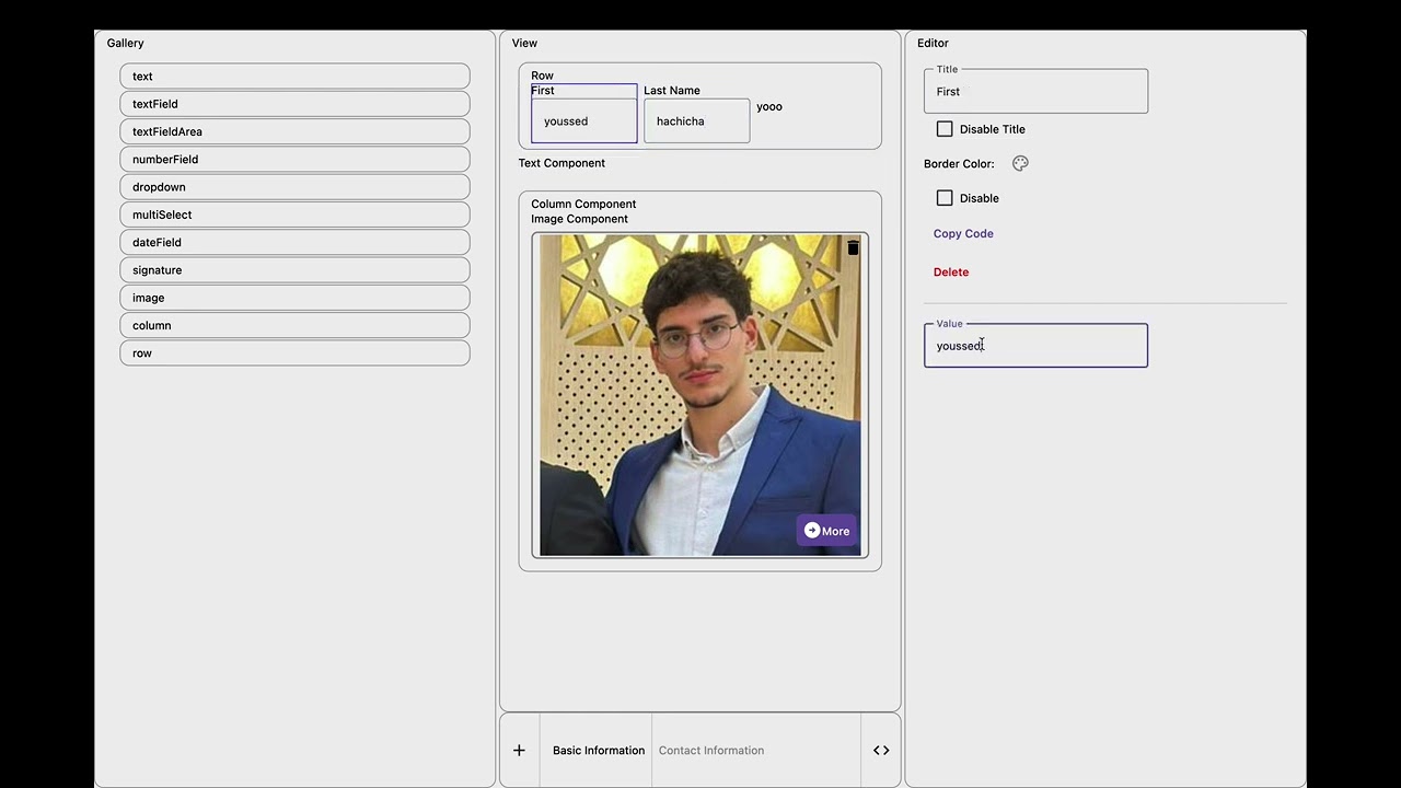
- Add Components: Easily add reusable components to your application.
- Add Screens: Seamlessly create and manage multiple screens.
- Edit Components: Modify and update existing components to suit your needs.
- Generate Code: Automatically generate the necessary code for screens and components.
Take a look at the interactive demo below to see these features in action:
To build the application bundle for Android:
- Run
./gradlew :composeApp:assembleDebug
To run the desktop application:
- Run
./gradlew :composeApp:run
To run the web application:
- Run
./gradlew :composeApp:jsBrowserDevelopmentRun
A declarative way to build your applications using a simple and intuitive Kotlin DSL.
buildApp {
    name("MyApp")              // Set your app name
    screen("User Profile")   // Create a screen
    // Add components here

}-
row { } - Creates a horizontal container for components
-
column { } - Creates a vertical container for components
-
textField("Label") - Single-line text input
-
textFieldArea("Label") - Multi-line text input
-
numberField("Label") - Numeric input field
-
dateField("Label") - Date picker component
-
dropdown("Label") - Single-select dropdown menu
-
multiSelect("Label") - Multi-select dropdown menu
-
text("Label") - Static text display
-
image("Label") - Image upload/display component
-
signature("Label") - Signature capture component
buildApp {
    name("Employee Directory")

    screen("Personal Information")
    row {
        textField("First Name")
        textField("Last Name")
    }
    column {
        textFieldArea("Address")
        numberField("Phone Number")
        dateField("Date of Birth")
    }
    row {
        dropdown("Department")
        multiSelect("Skills")
    }
    signature("Employee Signature")


    screen("Documents")
    column {
        text("Please upload required documents")
        image("Profile Photo")
        image("ID Card")
    }

}
Each component can be customized further with properties and event handlers.
Welcome, contribute!


