This notebook tries to predict Ahmedabad's weather using historical trends
- Data Loading & Preprocessing: Efficiently handles CSV data, cleans invalid entries, and prepares it for analysis.
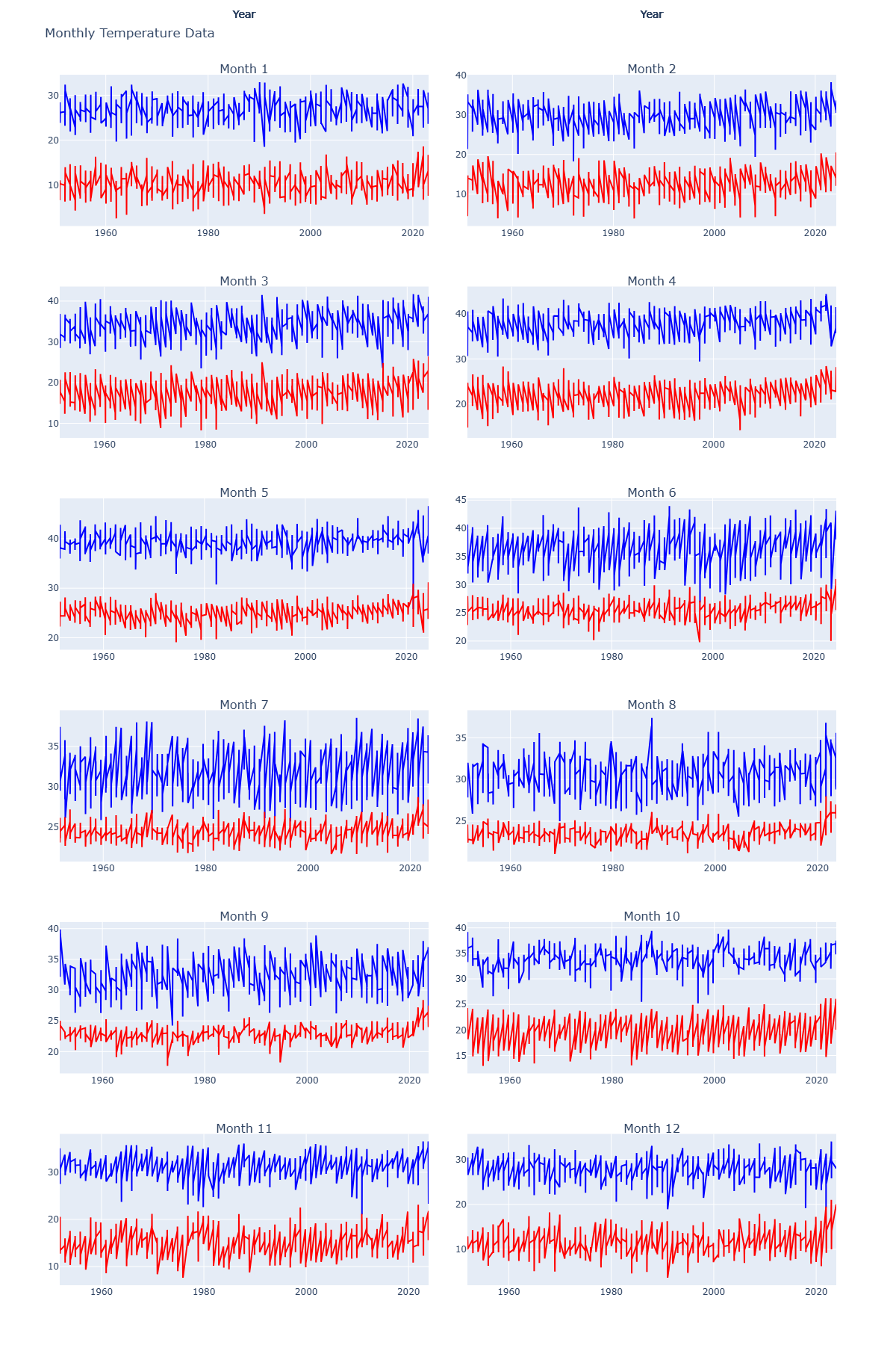
- Monthly Temperature Plots: Visualize maximum and minimum temperatures for each month using interactive Plotly plots.
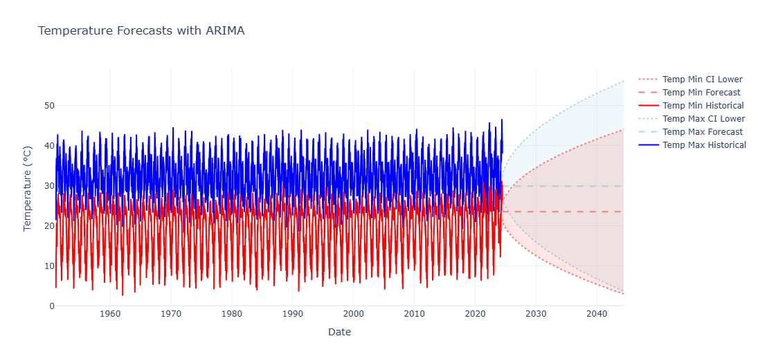
- ARIMA Forecasting: Predict future temperatures with ARIMA models, including confidence intervals.
- Additional Visualizations:
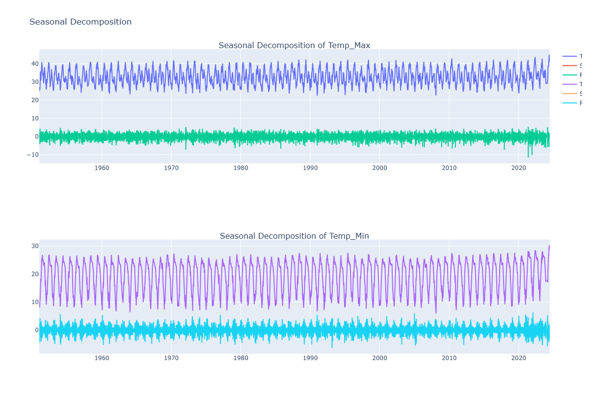
- Seasonal decomposition of temperature data.
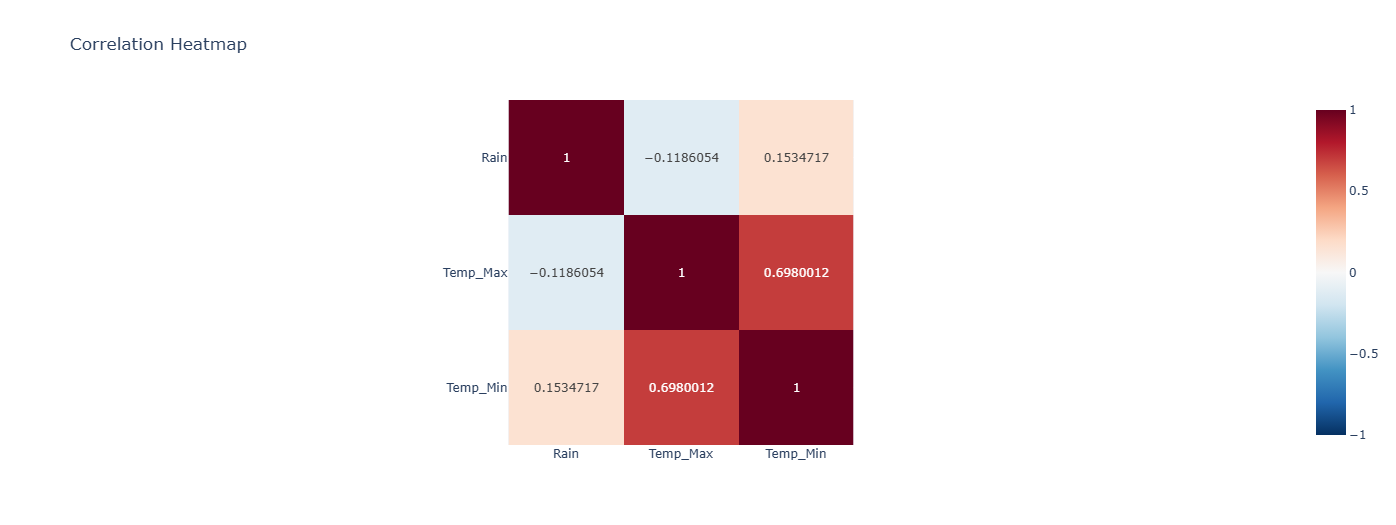
- Correlation heatmaps to explore relationships between variables.
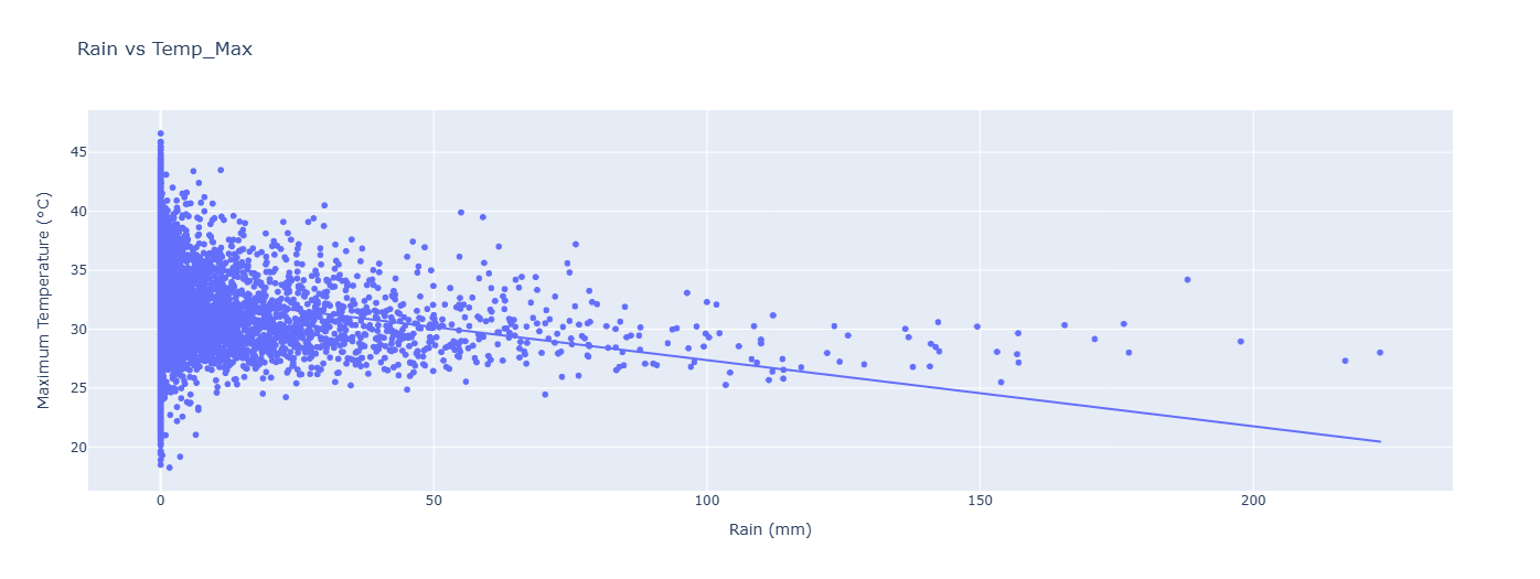
- Scatter plots showcasing the relationship between rainfall and temperatures.
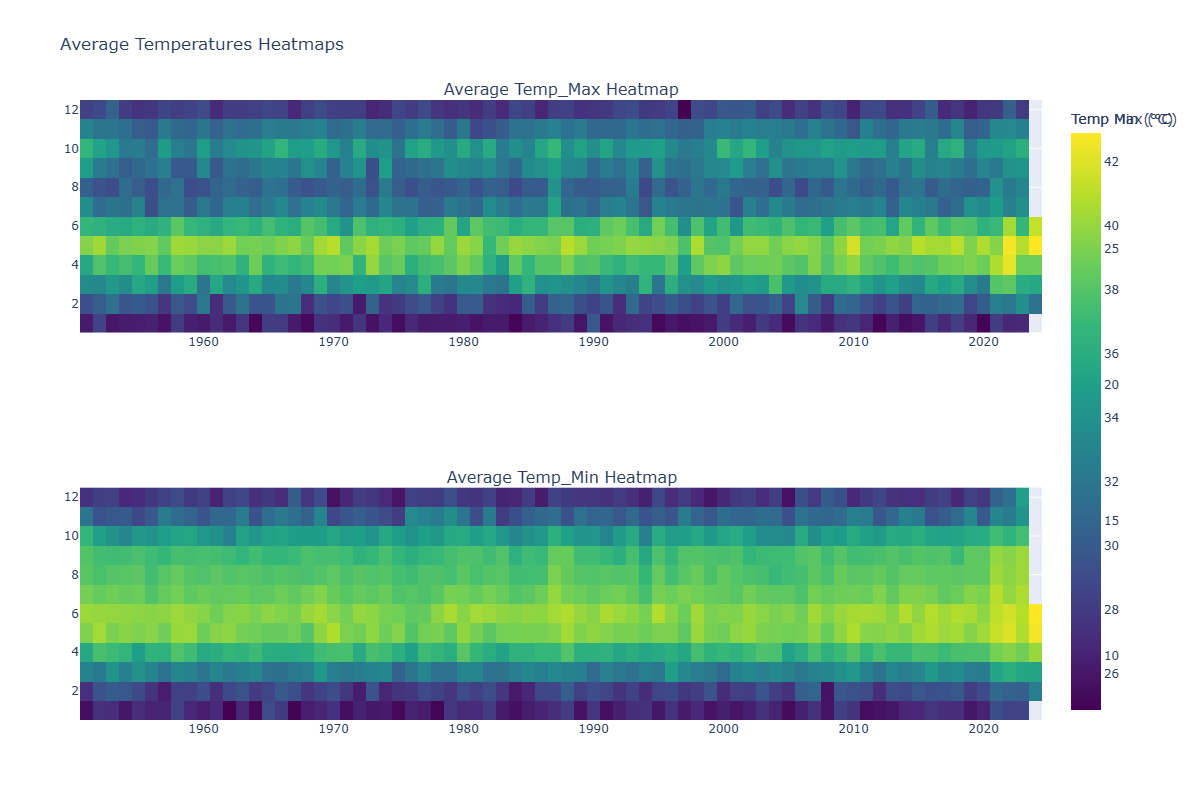
- Heatmaps displaying average temperatures by month and year.
- Interactive Dashboard (Optional): Structure provided for building a Plotly Dash dashboard to interact with the data in real-time.
Here's an overview of the visualizations you can generate with this script:
