reviz is a lightweight engine for reverse engineering data visualizations from the DOM. Its core goal is to assist in rapid visualization sketching and prototyping by automatically generating partial programs written using Observable Plot from input svg subtrees. reviz can be used directly through the core library, @reviz/compiler, or the Chrome extension, @reviz/extension.
For a hands-on, interactive introduction to reviz, check out the Hello reviz! notebook on Observable.
To get familiar with the various packages in this codebase, check out their respective READMEs.
@reviz/compiler– The core library and compiler.@reviz/examples– The examples site.@reviz/extension– The Chrome extension.@reviz/ui– Shared UI components used across therevizecosystem.
npm install @reviz/compiler🚧 Under Construction 🚧
The reviz API is very small; in fact, it consists of only a single function, analyzeVisualization!
import { analyzeVisualization } from '@reviz/compiler';

const viz = document.querySelector('#my-viz');

const { spec, program } = analyzeVisualization(viz);export declare const analyzeVisualization: (root: SVGSVGElement) => {
spec: VizSpec;
program: string;
};analyzeVisualization is a function that takes in an svg Element as input and returns an Object containing two properties, spec and program.
spec refers to the intermediate representation used by reviz to generate partial Observable Plot programs. It encodes semantic information about the input svg subtree, including its inferred visualization type, geometric attributes of its marks (either circle or rect elements), and presentational attributes of its marks. reviz's architecture mimics that of a traditional compiler, with spec acting as the intermediate representation (IR). It can be useful to examine spec to see whether or not reviz has inferred the correct visualization type for your input svg subtree.
program refers to the partial Observable Plot program that reviz generates. These programs are intentionally incomplete and contain "holes" represented by the string '??'. The presence of a hole indicates that the value for a particular attribute (e.g. the r attribute of a bubble chart or the fill attribute of a stacked bar chart) should be mapped to a column in a user's input dataset rather than kept static across all data elements. After filling in holes with column names from your input dataset, you'll have a complete visualization program ready to run in the browser!
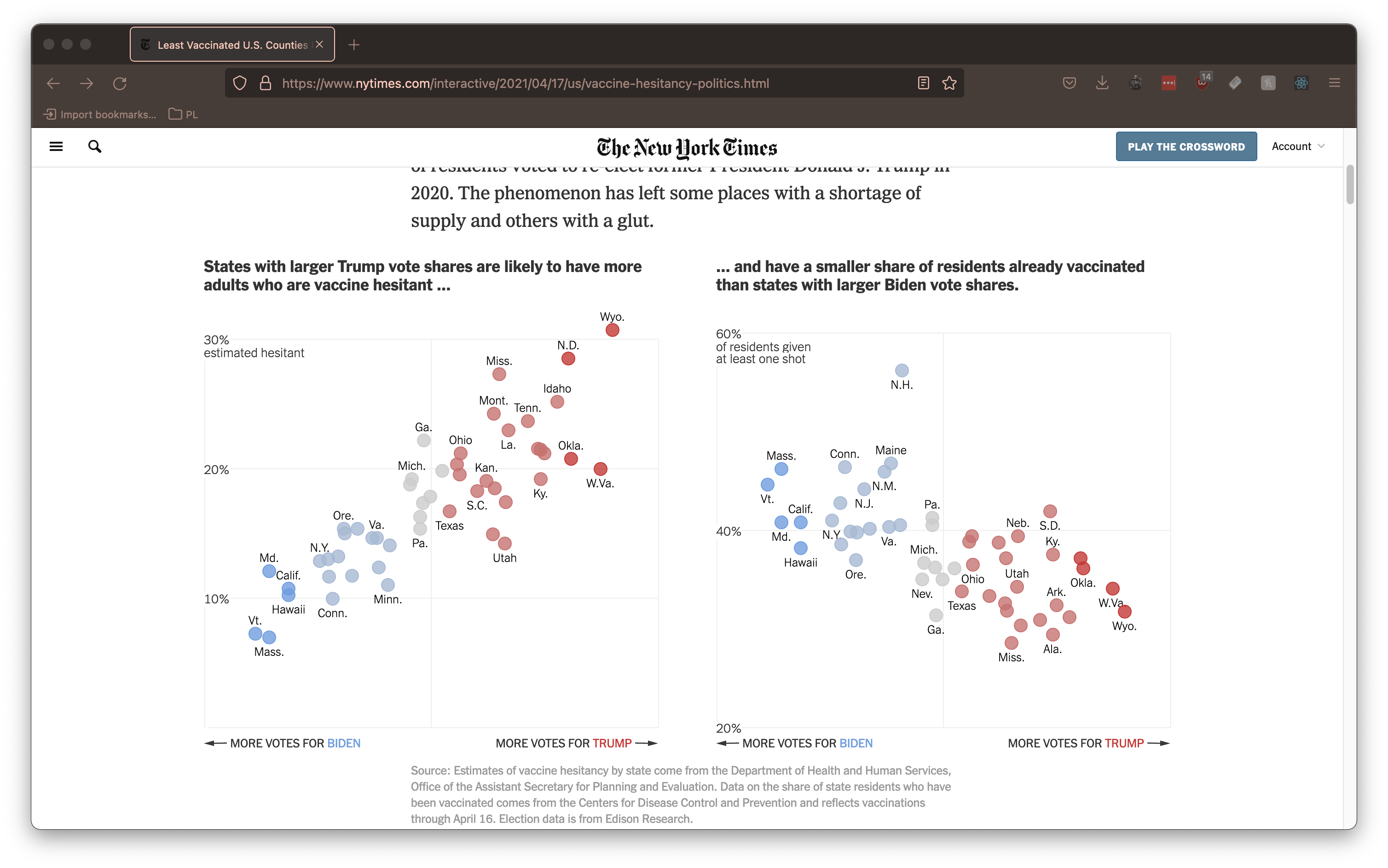
Let's look at an example to see how reviz works in practice. We'll use this visualization from the New York Times:
If we point reviz at the root svg Element of this visualization, it generates the following (partial) program:
Plot.plot({
  color: {
    scale: 'categorical',
    range: ['#C67371', '#ccc', '#709DDE', '#A7B9D3', '#C23734'],
  },
  marks: [
    Plot.dot(data, {
      fill: '??',
      stroke: '??',
      fillOpacity: 0.8,
      strokeOpacity: 1,
      strokeWidth: 1,
      x: '??',
      y: '??',
      r: 7,
    }),
  ],
});
Notice that fill, stroke, x and y are all inferred to be holes (indicated by'??') that must be mapped to columns of an input dataset. Conversely, attributes like fillOpacity and strokeWidth are automatically inferred because they are found to be consistent across all mark elements. We can also see that reviz has inferred that the visualization is using a categorical color scale and automatically configures the scale for us.
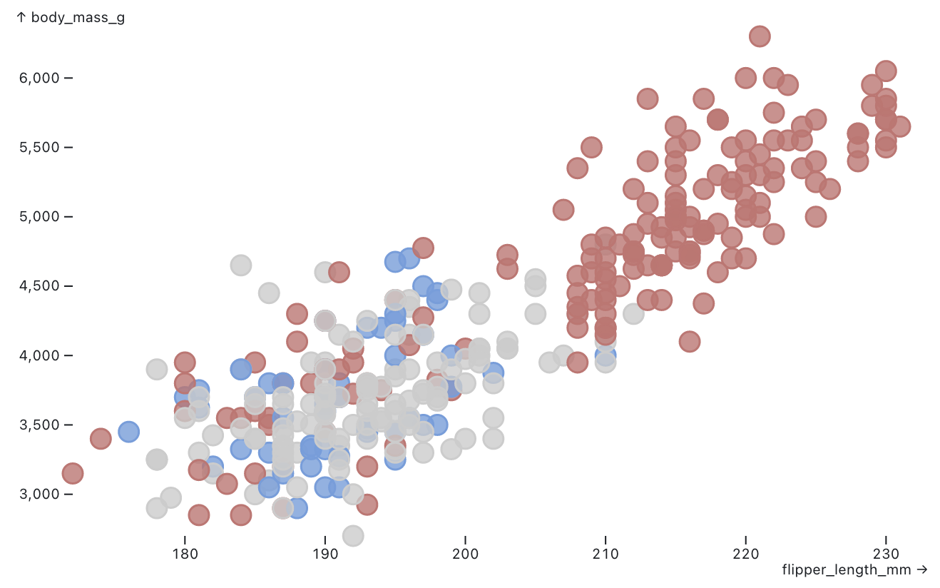
We can now apply this partial program to a new dataset. Let's use this delightful dataset about penguins from @Fil's Plot Exploration notebook. We can choose input columns from this dataset to "fill in" the holes like so:
Plot.plot({
  color: {
    scale: 'categorical',
    range: ['#C67371', '#ccc', '#709DDE', '#A7B9D3', '#C23734'],
  },
  marks: [
    Plot.dot(data, {
-     fill: '??',
+     fill: 'island',
-     stroke: '??',
+     stroke: 'island',
      fillOpacity: 0.8,
      strokeOpacity: 1,
      strokeWidth: 1,
-     x: '??',
+     x: 'flipper_length_mm',
-     y: '??',
+     y: 'body_mass_g',
      r: 7,
    }),
  ],
});
The result that we get is a new visualization that takes the appearance of the original New York Times piece and applies it to our data.
In this way, reviz allows end users to quickly experiment with seeing their data in the form of a visualization they encounter anywhere in the wild.
To see more examples of the partial programs reviz generates, check out our examples site. To understand how reviz works at a deeper level, consider reading our paper.
reviz is restricted to only work on a small subset of visualization types. We hope to extend reviz to include more visualization types in the future.
| Visualization Type | Description |
|---|---|
| Bar Chart | Old trusty. The bar chart represents data values using the height of each rect mark. The data values mapped to the x-axis must be discrete, not continuous. |
| Bubble Chart | The bubble chart is similar to the scatterplot, with the radius of each circle mark mapped to the square root of a data value. |
| Histogram | Similar to a bar chart, but the data values mapped to the x-axis must be continuous, not discrete. Histograms are typically used to visualize distributions in a dataset. |
| Scatterplot | The scatterplot places circle marks in an x-y coordinate plane, often to show a correlation between two variables. |
| Stacked Bar Chart | A dressed up version of the bar chart in which subcategories of data can be compared across groups. |
| Strip Plot | Many rows of circle marks are placed on the same continous scale to visualize distributions in a dataset. |

