Popover widget to show content in a styled popover element
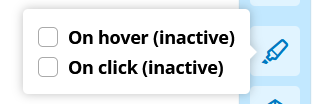
You can use this widget to render any content when interacting with the trigger. You can set the trigger on hover, left-click and right-click. When choosing right-click then the popover behaves like a context-menu and will position itself on the current mouse position. The widget will also work on mobile devices, the trigger will default to on-touch.
| Example 1 | Example 2 | Example 3 |
 |  |  |
- Place any content in the trigger-container to trigger the content-container
- Place any content in the content-container
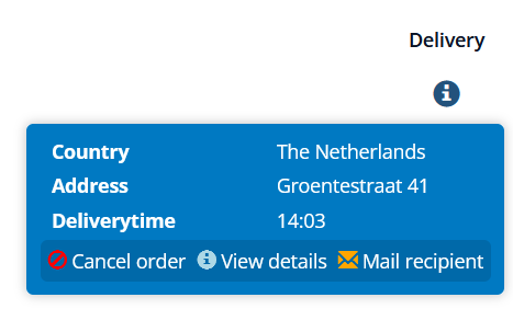
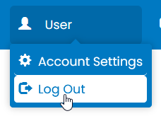
| Example 1 | Example 2 |
 |  |

- This can be used to create a context menu on a page when a user right-clicks an element.
- When you want to provide your users with more information about an item.
- This can be used with or without an context-object.
Avoid using margins/padding on the widget itself, if you want to add padding/margins place these on the elements inside the trigger and/or content-container.
If the popover-content is visible the class is-active is applied to the trigger-container. For example, you can apply extra styling to elements inside the trigger whenever the content is triggered.