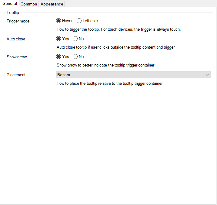
Tooltip widget to show a customizable tooltip on hover.
A tooltip is a brief, informative message that appears when a user interacts with an element. You can use this widget to display a tooltip when hovering over any element. Any element can be used as a trigger for the container. The content-container content is only loaded when hovering over the trigger. No need to create a class for every tooltip. The tooltip is customizable.
| Example 1 | Example 2 | Example 3 |
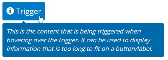 |  |  |
- Place any content in the tooltip trigger-container to trigger tooltip visibility.
- Place any content in the content-container to display when hovering over the trigger-container.
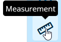
- When you need to provide the user brief informative message when hovering over an icon-button.
- This can be used with or without context.
You can stylize both trigger and content. If you want to style the content, the best way to do this is adding a container to the content pane and apply styling to the container.