The goal of this app is to better plan a valuestreams program increment by planning based on previous performance. It is similar to how a team will plan a sprint based on their sprint velocity.

This app visualizes feature change in scope during a program increment. Scope change is measured against a baseline (vertical redline). Features added are shown 'below the line'. You can mouse over any column to see a summary at the point in time; clicking on a column will show the detailed features at that point in time.

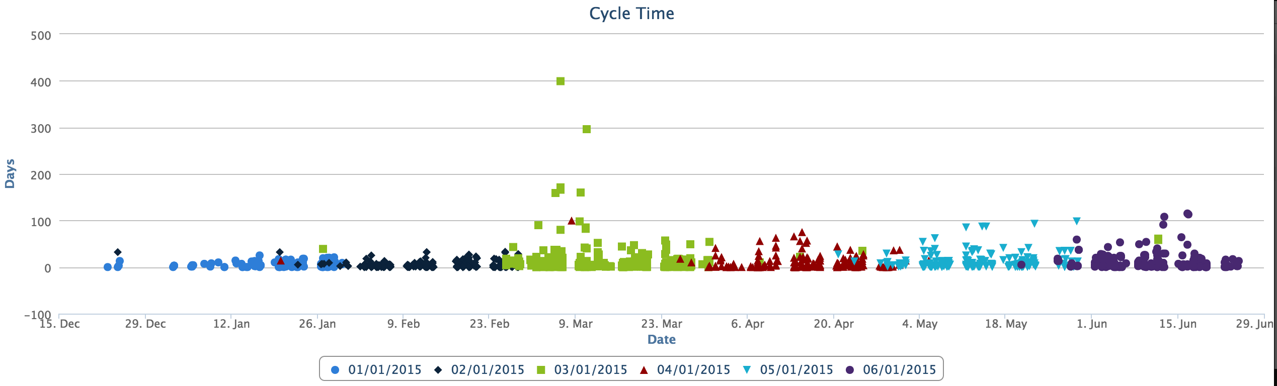
Visualizes how long items take to flow through the value stream. May be configured for both type (ie. Feature, Story etc) and States. Mouse over an item to see it's details.
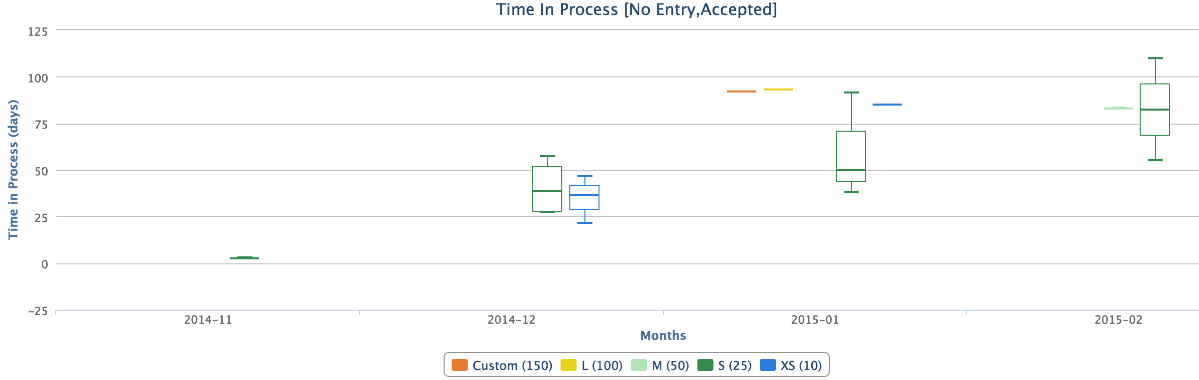
This is another portfolio item cycle time visualization but it is grouped by item size and uses a box plot to show median, 25th and 75th percentile values.
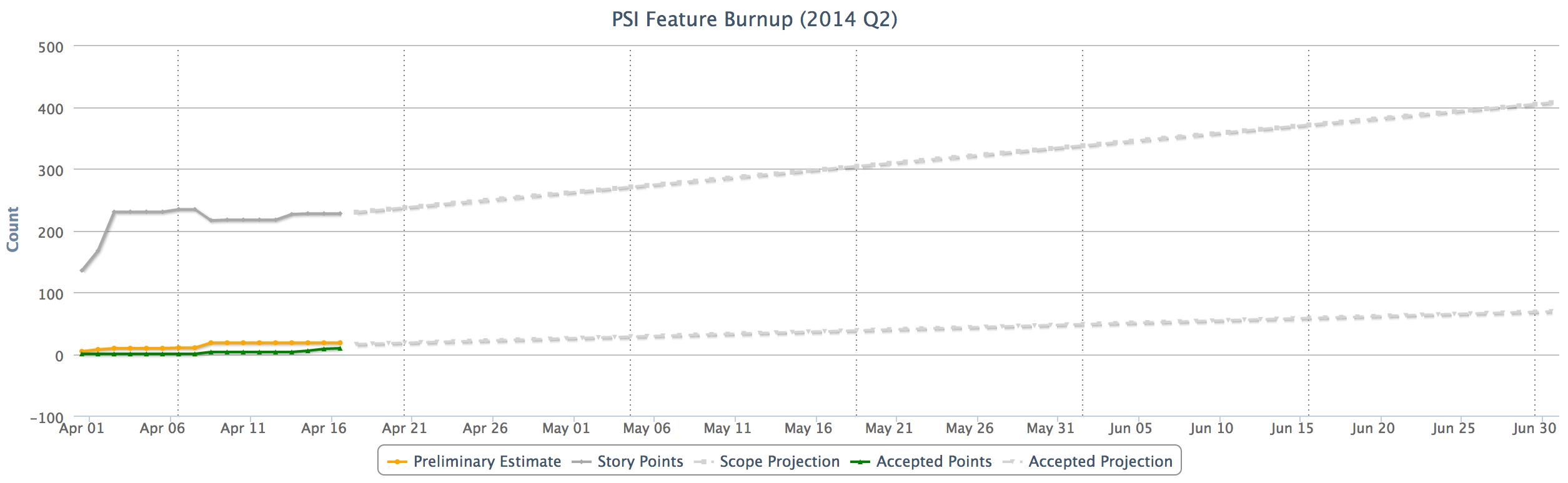
Provides a burnup of progress against a value stream program increment, including forecast for scope and progress.
Provides a graph visualization of the dependency relationship between stories. Uses the D3 visualization library.
Provides a roll up of defect, task and dependency information for features in a selected program increment (release).
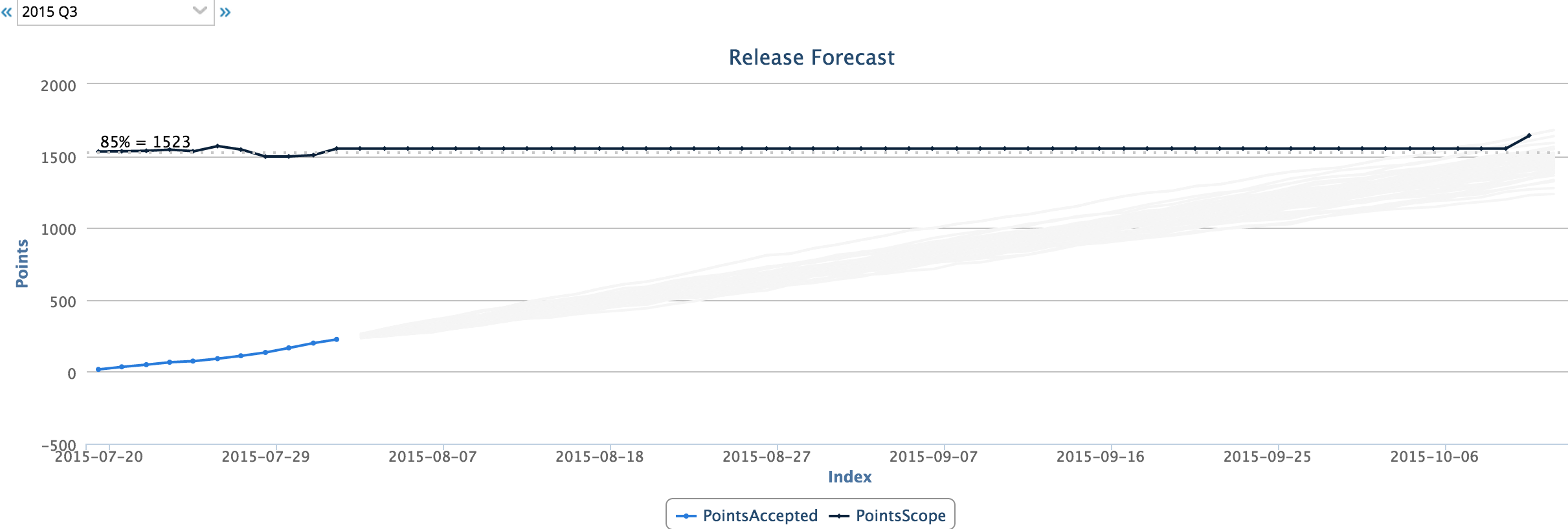
Uses progress information and a simple monte-carlo algorithm to forecast completion of a program increment (release).